
Dividend investing isn't as easy as picking the highest-yielding stocks. Companies can and do cut their dividends -- even companies that have increased their dividends for decades on end -- and picking investments based solely on yield can be a recipe for disaster.
What is a dividend?
A dividend is a way for a company to return cash to investors, rewarding them for owning shares. A steadily increasing dividend is a clear sign that a company is successfully growing its business -- the type of company income investors would most like to own. Dividend increases signal to investors that management believes the company's future is bright. And management teams generally don't want to cut dividends, so they try not to push them up to unsustainable levels. But that doesn't mean dividends never get cut.
They do.
And when they do get cut, investors are not happy. They're losing the payout and getting an indication that the business is struggling. Investors need to keep their eyes open when it comes to dividends and look for companies that balance a high yield with the ability to support the payout (and hopefully grow it over time).
There's no guaranteed way to protect yourself from a dividend cut, but there are signs you can look for to figure out if a dividend is at risk. Here are three clues you should pay close attention to.

Image source: Getty Images
1. Payout ratios
The most commonly examined ratio to assess dividend strength is the payout ratio, which compares dividends to earnings. It's a pretty good start, since a company that's paying more in dividends than it earns is theoretically not capable of supporting its payout.
The term "theoretically" here is important, however, because dividends don't actually get paid out of earnings. They are paid from cash flow.
For example, real estate investment trusts (REITs) often pay dividends that exceed their earnings because of non-cash depreciation charges. The REIT structure is specifically designed to own physical buildings, which are subject to large depreciation expenses. Depreciation reduces the value of an asset by a little each year to account for wear and tear (and eventual obsolescence, in some cases), and those costs pass through the income statement. But that reduction is really an accounting tool -- nobody is physically taking that money from the company. So while REITs have huge depreciation expenses, those costs don't impact the cash they generate.

O Payout Ratio (TTM) data by YCharts
The chart above for Realty Income (O 1.45%), a bellwether REIT with a 27-year history of annual dividend increases, shows the difference here. This is an extreme example, but it is applicable to all companies.
That doesn't mean the payout ratio is meaningless -- in fact, it is an important warning sign that trouble could be brewing. But it shouldn't be the only thing you examine. You also need to examine the cash dividend payout ratio, which looks at dividends relative to cash flow. A high ratio on either of these metrics -- or both -- should put dividend investors on edge. Anything approaching 100% should be particularly worrying.
2. Balance sheet
Payout ratio and cash dividend payout ratio, however, aren't the only issues to consider when assessing dividend safety. They are just a way to see if a company is having an easy or hard time covering the cost of its dividend. Yes, that alone could lead to a cut, but a cut is more likely to happen if there are other factors at play. One key place to look for weakness is the balance sheet, the financial foundation on which companies are built.
Take ExxonMobil (XOM 1.13%) and Eni (E 1.17%), for example, two of the world's largest integrated energy companies. Exxon has a long history of being fiscally conservative, while Eni has a history of being more aggressive with its balance sheet. The chart below compares the debt to equity ratios, a measure of how much debt a company uses, and tells the story pretty well. But here's the thing: Volatile energy prices are often the driving force behind these businesses.

XOM Debt to Equity Ratio (Annual) data by YCharts
When oil prices plummet like they did in mid-2014 (notice the red line on the graph), Exxon can rely on its balance sheet to help support its business and dividend while its earnings are weak (and it isn't capable of covering the dividend). In fact, the oil giant's debt to equity ratio increased a bit during that tough patch, but it didn't come anywhere near a concerning level. Exxon kept increasing its dividend each and every year, a feat that few of its closest peers were able to achieve. Eni had much less leeway because it was already heavily leveraged, which helps explain why the 2014 oil drop led to a dividend cut. When faced with difficult market conditions, heavily leveraged companies may have no choice but to cut their dividends so they can apply cash to other purposes.
That, in fact, is often the best choice for a company, even if it is a disaster for shareholders who have come to rely on its dividend. For example, in 2016 Kinder Morgan (KMI 3.21%) had to choose between its dividend and funding growth projects. The midstream company tends to make more aggressive use of leverage than many of its peers (see the debt to EBITDA ratios in the chart below), and tapping the capital markets at that point in time would have been expensive. So management trimmed the dividend by a massive 75%. That allowed it to get through a tough patch, and it is now back to hiking its dividend again.

KMI Financial Debt to EBITDA (TTM) data by YCharts
Here's the thing: Kinder Morgan had a long history of regular dividend increases behind it. And management was actually telling investors to expect a dividend increase of as much as 10% in 2016, just a couple months before the cut was announced. If you just looked at history here (and listened to management), you'd have been blindsided. If you also considered the company's lofty leverage metrics, you'd have been justifiably concerned, and perhaps would have avoided the company. Note, too, that Kinder Morgan's cash dividend payout ratio was above 100% in 2015 and 2016, showing the value of layering these tools atop one another.
3. Interest expenses
The strength of a company's balance sheet is an important indicator, but you'll also want to look at how well it can handle the debt it has taken on. For this you should look at times interest earned, which compares interest expenses to income. The higher the number the better, since it means interest expenses are better covered. Kinder Morgan's times interest earned was 3 in 2014 before it fell to less than 1.5 in 2016 -- a far more worrying figure. Each company is different, but you'll want to look for changes and consider what the change really indicates. For Kinder Morgan it was yet another sign that market conditions were causing serious financial stress.
But how about General Mills (GIS 2.01%), where the times interest earned figure has fallen from over 8 to around 5? That decline came about because of a massive increase in debt. The chart below looks pretty concerning, until you think through the situation a little: The debt was used to buy Blue Buffalo, an industry-leading healthy pet food maker that is expected to help General Mills grow its business. And just as important, covering interest expenses 5 times is still pretty solid. Moreover, the company has specifically stated that debt reduction is a key goal. In fact, it plans to hold the dividend steady for a few years while it focuses on that goal.
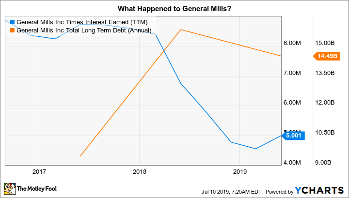
GIS Times Interest Earned (TTM) data by YCharts
Now, when a company that has a long streak of annual dividend increases behind it suddenly holds the dividend steady you need to stop and take a look at what's going on. (This is a good fourth signal to look at, by the way.) But in this case, General Mills has been open about what it is doing and is working from a position of financial strength, as it can still easily cover its interest expenses. No particular need to worry, though you should be watching the Blue Buffalo integration process closely.
General Mills tends to make heavy use of leverage overall, but because of its business model (selling lots of small "necessity" food products to lots of end customers) it has been able to carry the weight of that debt relatively easily, as indicated by times interest earned.
More tools for your tool box
Now for the bad news: There is no sure-fire way to figure out what a company is going to do with its dividend. That decision is up to the board of directors. All you can do is pay close attention and use the information that is available to you to give yourself a feel for how much risk you are facing on the dividend front. Ideally, you should simply avoid situations where the dividend doesn't look particularly secure.
A high payout ratio (relative to earnings and cash flow), a heavy debt load, and weak interest coverage are all prime indicators of elevated risk. As you check more and more of these off, your risk of a dividend cut gets higher and higher. While all income investors are tempted by high yields, if a lofty yield comes with too much risk it probably isn't worth buying the stock. These tools can help you make that call.


