
Investment legend Warren Buffett has said: "Once you have ordinary intelligence, what you need is the temperament to control the urges that get other people into trouble in investing." This one chart, when applied correctly, can help you avoid those urges, collect large dividend checks, and invest with a contrarian bent. Here's how to use it.
It's a type of chart, not a specific chart
There's no point keeping you in suspense: The chart we're discussing here is best described as relative dividend yield. When investors think about valuation, they often default to the price-to-earnings ratio. Only there's a major problem with earnings: They can be volatile and, unfortunately, prone to manipulation. Dividends, on the other hand, are fairly consistent over time for most companies, making them a more useful way to examine valuation.
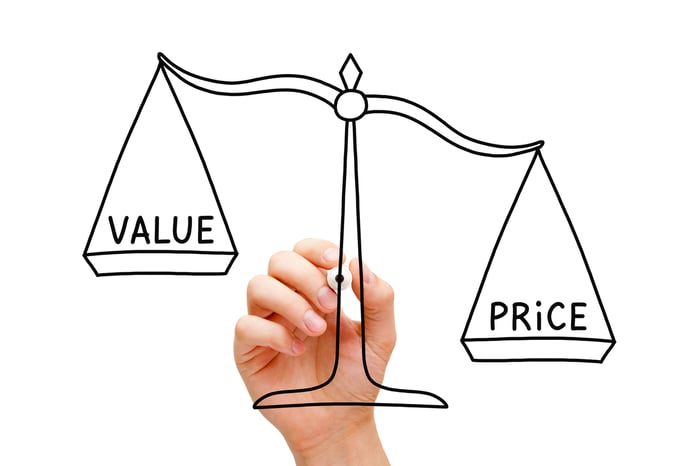
Image source: Getty Images.
Indeed, dividends are often used as a signaling mechanism for a company to tangibly show investors what management and the board think of the business's future prospects. And companies are generally loath to cut a dividend, since investors tend to react very negatively to such moves (noting the implication of what the decision says about the future).
Keeping things simple, a historically high yield would suggest a stock is cheap, while a historically low yield would suggest it is overpriced. No rocket science here; even mere mortals can grasp that logic.
To be fair, not all companies pay dividends, so it won't work universally. You also need to make sure you are looking at companies with consistent dividend histories (some dividend payers have unique or variable payment approaches). However, there are many companies for which relative dividend yield will tell you a lot. Here are a couple of examples.
When it's time to buy
In 2016, Procter & Gamble's (PG 0.29%) iconic consumer staples business had grown unwieldy. Management jettisoned smaller, less profitable brands so it could focus all of its attention on a smaller number of leading ones. Wall Street wasn't convinced that this would solve the company's growth problem, so uncertainty was in the air and the stock price was weak.
However, Procter & Gamble had more than 50 years' worth of annual dividend increases under its belt, making it a vaunted Dividend King. And there was no particular reason to expect the streak to end based on management's commentary at the time. The low price, meanwhile, pushed the yield toward a historical high point.

PG Dividend Yield data by YCharts.
In the graph above, you can see the two peaks toward the end of the image where the dividend yield rises above 3.5% or so, even approaching 4%. The first yield spike is from the time of P&G's divestment effort and, looking back now, it was a great opportunity to lock in a high yield from an iconic company with a great track record of success behind it.
Organic sales growth has ticked up since the business overhaul, and it has been reflected in the stock price. In hindsight, it's clear that Wall Street was unduly pessimistic at the time and the elevated yield underscored that. Today, as the chart also shows, Procter & Gamble looks a bit expensive.
Hormel (HRL 0.20%), however, looks attractive right now.

HRL Dividend Yield data by YCharts.
As the chart above shows, Hormel's yield sometimes spikes into the 2.3% to 2.4% range. However, it normally sits below -- often well below -- 2%. So when the yield gets toward the high end of its historical range, investors should start to get interested, noting that the food maker has a five-decade-plus history of annual dividend increases behind it.
The most recent spike to 2.3% is largely related to two things. First, inflation is heating up and putting pressure on the company's margins. Inflation is a basic part of business life and food companies have long managed to pass rising costs along to customers. It just takes some time.
Second, Hormel recently made a large acquisition, taking on the Planters brand. That's pushed leverage up, but not to unreasonable levels. And Hormel has a history of paying down debt after acquisitions. Meanwhile, Planters is an industry-leading name that fits well with Hormel's protein focus. It also expands the company's reach in the convenience store space. Strategically, it looks like a good fit.
And all of the uncertainty today appears to have made Hormel an attractive buy when you look at its historically high yield. You just have to trust that management knows what it is doing this time around -- just like it has every other time the yield has jumped into the 2.3% range.
Not perfect, but a valuable tool
Nothing works 100% of the time on Wall Street, and the relative dividend yield is no different. You need to make sure the companies you are looking at are strong businesses. Sticking to long-term dividend payers, like Dividend Aristocrats, can quickly help sort that out.
However, relative dividend yield can get you in the door when others are fearful. It can help you lock in relatively high yields that others are shunning. And it will keep you away from the fads and crazes that far too often sandbag investors as they end up buying high and selling low. If that sounds like a good approach to you, now might be a good time to start looking at relative dividend yield -- and perhaps Hormel, too.


