
A lot can happen in five years. A newborn baby might become a kindergartener, a new president might be elected, a hot new website might grow from a user base of 100 million to more than a billion -- and a surging bull market can begin and end. In fact, one recent bull market continued for exactly five years before it fell apart in horrific fashion. The crash that followed was the worst to strike down the Dow Jones Industrial Average (^DJI 0.06%) since the Great Depression. The crash ended on March 9, 2009, exactly five years ago today, and if the Dow can push past the all-time high it reached at the end of 2013, it, too, will be a five-year-strong bull market -- and it might go much further still.
But how sustainable is the current rally? That depends on a number of factors, not the least of which include corporate profits, market valuations, investor sentiment, and economic stability. We can't know for certain if any of these important factors will continue to improve, but we can look back at the market's five-year rebound to see how each factor has affected it.
Let's start with a simple comparison between the two most notable stock indexes in America, the Dow and the S&P 500 (^GSPC -0.22%). We can't expect them to match up exactly, but have they at least kept closely in track with each other? Surprisingly, the Dow has fallen rather far behind its broader peer, an underperformance that began roughly in mid-2012:

What's caused this discrepancy? Until the fall of 2013, the Dow had two notable underperformers in Alcoa, which recorded a 61% gain to the Dow's 136%, and Hewlett-Packard, which lost 10% from the start of the rebound to the day of its removal. IBM, historically the most heavily weighted Dow component, has also underperformed the Dow since the rebound began, even when reinvested dividends are taken into account.
There is certainly more data available on the S&P 500's performance, so let's dig a little deeper into that index's performance since March 9, 2009. Let's start with the difference between the index and its dividend-adjusted total return (which you can actually achieve or best by investing in one of many S&P 500-based dividend-paying index funds, like the SPDR S&P Dividend ETF (SDY 0.52%)):

Dividends do make a bit of difference for the S&P 500, as its return swells by another 31.5% over its baseline growth when reinvestment comes into play. How does that compare to earlier bull markets?
|
S&P 500 Growth |
S&P 500 Total Teturn (Dividends Reinvested) |
Dividend Premium (Annualized Growth/Year) | |
|---|---|---|---|
|
2009-present |
176.7% |
208.7% |
2.7% |
|
2002-2007 |
101.5% |
120.7% |
2.1% |
|
1990-2000 |
395.9% |
518.4% |
2.6% |
Source: YCharts, DailyFinance, and Yahoo! Finance.
It's worth noting that the S&P's aggregate dividend yield, while not particularly high, has actually remained at levels not regularly seen since the late 1990s for most of its current five-year bull market:

S&P 500 Dividend Yield data by YCharts
But there are other factors at play as well. For one thing, the S&P's aggregate earnings fell off a cliff during the financial crisis, but have since recovered to the highest level ever seen, in both nominal and real terms:
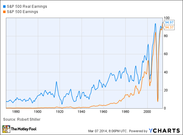
S&P 500 Real Earnings data by YCharts
The current bull market started its earnings rebound from such a wretchedly low starting point that we may never again see the kind of bottom-line growth the S&P 500's components have strung together since 2009. In fact, the current bull market boasts by a very wide margin the largest real earnings growth of S&P 500 components out of any expansionary period in over 100 years of analysis by economist Robert Shiller (we'll focus on only the larger bull markets for brevity):
|
Real Earnings Growth |
Total Market* Growth | |
|---|---|---|
|
2009-present |
1,170%** |
150.8% |
|
2002-2007 |
132.3% |
94.4% |
|
1990-2000 |
76.8% |
395.7% |
|
1982-1987 |
(7.1%) |
250.4% |
|
1962-1966 |
43.4% |
85.8% |
|
1957-1961 |
(15%) |
74.9% |
|
1949-1956 |
37.1% |
222.4% |
|
1942-1946 |
(24.5%) |
128.7% |
|
1932-1937 |
111.2% |
371.6% |
|
1921-1929 |
241% |
496.5% |
|
1896-1899 |
67.6% |
170.8% |
Source: YCharts and Robert Shiller.
*Growth of Dow Jones Industrial Average used because of more accurate daily closing data.
**Earnings growth only current to Q3 2013.
It's worth noting that if we start from a point at which the S&P 500's earnings weren't at historic lows, then real earnings growth looks far more modest -- stretching our date range back to March 2008 rather than 2009, at which point earnings were rapidly sliding but not completely over the edge, gives us real earnings growth of 45.3%.
Neither dividends nor earnings growth can really account for all of the gains in a bull market, because investors will inevitably bid up stocks faster than the companies behind them can increase earnings. This, in a nutshell, is valuation expansion, and we often use the cyclically adjusted P/E ratio, or CAPE, developed by Robert Shiller to smooth out the wild swings in valuation you might see in a crash like the one from which we've been recovering for the past five years. Here's how much the CAPE has grown since the start of the current bull market:

According to this metric, a little less than half of the current market's gains can be explained by valuation expansion, which is roughly in line with the valuation expansion seen in several other durable bull markets, as I examined last year (click here to learn more). However, bearish analysts are often keen to point out that the CAPE itself is now reaching back toward the levels it last left behind during the financial-crisis crash:

S&P 500 Cyclically Adjusted Price-Earnings Ratio data by YCharts
This alone may not be enough to justify alarm, but it all depends on how you interpret the other valuation metrics available to us as informed investors. Late last year, Josh Brown published research done by Merrill Lynch's Savita Subramanian that showed 12 of 15 valuation metrics -- including various P/E ratios, EV/EBITDA, price-to-free-cash-flow, price-to-book-value, and some other esoteric measures -- were historically undervalued compared to more recent averages. Shiller's metric has been calculated since 1871, which is about as similar to our current market environment as a steam locomotive is to a 747. Brown has also written extensively on why the CAPE itself may not be as relevant to modern investors as many would like to believe. On the other hand, Orcam Financial Services founder and Pragmatic Capitalism blogger Cullen Roche found that certain broad-based valuation metrics, like gross national product to total stock market capitalization, and equity prices to revenues, corroborate the CAPE's apparent warnings of overvaluation.
Is today's market overvalued? Is it just getting started? The answer could be right in front of us, waiting to be discovered any day now.


