Published April 22, 2024
Landing pages act as both marketing collateral and sales tools. Learn the best practices for landing pages from these stellar examples.
A business website is one of the key ingredients of a successful company. Of the 329 million people in the U.S., 293 million, nearly 90% of the population, are internet users. A website presents the most effective, inexpensive means available today to reach these users.
That’s where landing pages come in. A landing page is a marketing term that refers to a unique page on your website constructed to accomplish specific business objectives. Internet users visit your landing page through a marketing campaign.
For instance, visitors to your landing page might arrive via a marketing channel such as an online advertisement. They clicked on your ad to learn more, and are taken to the landing page where they’re presented with content geared towards accomplishing your business objective, like collecting their email address to move them into your sales funnel.
Today, content management systems lets you build landing pages without requiring you to have deep technical knowledge. Still, before diving into landing page creation, you need to know how to design them to achieve your business goal.
Let’s explore some landing page samples to help you learn how to design your own.
7 best landing page examples you can learn from:
- Wix
- Shopify
- Clearbanc
- Lyft
- Zoho
- Mailchimp
- JustAnswer
What all successful landing pages have in common
Although every landing page is uniquely designed to achieve a specific business objective, they all exhibit the same key characteristics. To maximize the success of your landing page, include these elements.
User-friendly design
Arrange content on the landing page to focus on your objectives and to encourage visitors to take action by employing a user-friendly design. This concept entails creating a webpage that visitors find pleasurable, informational, and easy to use.
To execute a user-friendly design, strip the page of any distractions to encourage visitors to act on your goal, such as buying your products. Also, use a clearly visible call-to-action, a marketing term referring to instructional text designed to generate an immediate response.
For example, if you want visitors to sign up for a newsletter, limit the content on the page to discussing the merits of the newsletter, and display a call-to-action to get them to sign up.
Web analytics
A landing page can struggle to meet your business goals at the outset. To understand why, you must measure what happens on the page.
To do this, add analytics software, such as Google Analytics, to the landing page to collect data about your visitors and their behaviors. Doing so reveals valuable data such as how much time visitors spend on the page.
If they visit for only a few seconds, some element of the landing page is turning them away, or it could mean the page loads slowly. With web analytics data, you are not flying blind, and can make informed decisions.
Website security
The security of your landing page can easily be overlooked, so ensure the page is secure. This means the URL starts with "https://" and not "http://." This is particularly important when you want to collect personal information, such as an email, from visitors.
Without this basic level of security, visitors are discouraged from sharing information with you, hindering your ability to move them down the sales funnel. Moreover, search engines such as Google and other sources of consumer website traffic penalize a site with poor security.
Incentives
Landing pages are a type of marketing collateral. As such, visitors typically arrive via some sort of online advertisement. The ad generated interest, but because it’s an ad, a healthy dose of skepticism accompanies the consumer’s visit.
To build trust, especially when asking for personal information, provide visitors with an incentive. This can take many forms such as product discounts, a downloadable research report, or even simply outlining the benefits of buying from your business.
Mobile compatibility
No longer tethered to desktop computers, consumers today perform many online tasks on their mobile phones. A poor mobile experience turns off visitors to your landing page, and since you’re paying for each visit, this erodes your ability to hit your marketing metrics. So ensure your landing page translates well on mobile devices.
7 great landing page examples to learn from
Landing pages are an effective component of an integrated marketing plan, but that doesn’t mean these pages must be salesy, staid, or boring. Let’s go on a journey through some top landing pages, and you’ll notice how well each aligns with the intended business objective while reinforcing the company’s brand positioning.
1. Wix
Let’s be honest. You can’t wait to start building your landing page. So you seek out a content management system (CMS) and come across an ad for Wix, a top rated CMS. When you arrive at the Wix landing page, you see minimal text and a single button with a powerful call-to-action, "Start Now."
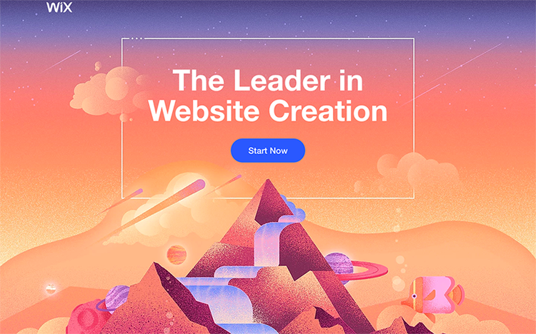
The top of the landing page sports an eye-catching design to pull you in. Image source: Author

As you scroll down the landing page, it continues the visual impact introduced at the start while walking you through the benefits. Image source: Author

The landing page ends with a reiteration of the call-to-action. Image source: Author
This landing page design is effective because it focuses on driving you through the Wix sales funnel. There isn’t much text to distract or bore you. However, if you want additional information, you can simply scroll down the landing page to learn more.
Most importantly, the landing page shows off the power of the Wix CMS. The background is visually stunning, reinforcing what Wix can do for you while remaining clean and simple. It doesn’t try hard to convince you through a ton of salesy text. The landing page speaks for itself.
What you can take from Wix:
Incorporate the lessons from the Wix landing page example by employing these tips.
- Keep it simple: As this excellent landing page illustrates, less is more. The text is minimal. All the information is contained on the landing page. No navigation to other pages is presented except to the Wix homepage and legal disclaimers. The lack of bells and whistles helps you stay focused on the task of considering Wix as your CMS.
- Create visual appeal: Let the visuals on the page do the heavy lifting by conveying what your offerings can deliver. This approach is particularly effective since 65% of us are visual learners, according to a study by the Social Science Research Network.
- Single call-to-action: Limit the landing page to one call-to-action. This prevents visitors from becoming confused about what they should do next. Notice in the Wix example that the call-to-action is only the blue "Start Now" button. It’s also repeated throughout the landing page, including at the bottom. Also, this call-to-action doesn’t change colors or text; it remains consistent throughout. This reinforces the call-to-action to the visitor, makes it convenient for them to take action at any time, and continues to encourage them to act without being obnoxious.
2. Shopify
Let’s say your business is in the e-commerce space. Consequently, not just any CMS will do. You want one that specializes in e-commerce. That’s when you discover Shopify's landing page.
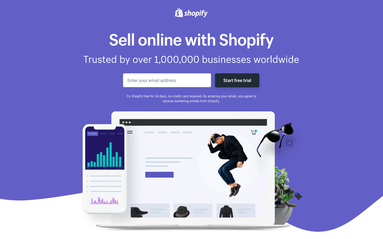
This landing page builds trust by highlighting the number of businesses Shopify has helped. Image source: Author
Shopify incorporates all the characteristics of good landing pages. Like the Wix example, the Shopify landing page is simple. Its focus is on a single call-to-action: entering your email address. And like the Wix page, Shopify employs very little text. Instead, it uses a few key selling points to convince you to buy.
Moreover, if you were to examine the URL for this page, you’ll see it’s very long with a number of seemingly random elements like "Network=Search," which tells Shopify that you arrived at this page through a search engine. This is part of how Shopify collects web analytics data on landing page performance. And the URL employs the requisite "https://" to make it secure.
Also, Shopify incentivizes you to provide an email address. The company highlights how it’s used by over a million businesses. This creates trust and confidence in its service, and Shopify reinforces that feeling by literally using the word "trusted" in its ad copy. As an additional incentive, it highlights that you can start using the service for free.
Lastly, this landing page is identical for both desktop and mobile device users. Because Shopify keeps the design simple, it can easily do that.
What you can take from Shopify:
Here are the strategic characteristics from the Shopify example to apply to your landing pages.
- Identify key selling points: Shopify highlighted what makes its service compelling. Do the same for your landing page content. You want to keep this to the most important selling points, so be judicious.
- Test, then test again: What you think are your top selling points may not matter to your customers. You learn this through testing. Apply web analytics, launch the landing page, then collect data on its performance. If you seek performance improvements, change one aspect of the page, then collect more data. Continue adjusting single page elements until you see measurable improvement. That’s how you know you’ve hit on what matters to clients.
- Include the incentive: Your selling points may be irresistible to some, but everyone likes free stuff. So don’t forget the incentive. Offer a free trial or add-on with purchase. Even a simple discount can tip the balance between a conversion and someone who leaves without buying.
3. Clearbanc
You’ve found your e-commerce provider. Now you require funding for your business. Clearbanc provides capital to start your own business, and its landing page immediately outlines why it's the ideal choice for you, while weeding out those who are not a good customer fit, by highlighting how it’s the world’s largest e-commerce investor.
Like all great landing pages, Clearbanc puts its online form front and center so it can capture your personal information. Because thousands of dollars are at stake, you can’t simply provide an email address like Shopify’s page. But rather than confront you with a massive form at the outset, Clearbanc strategically starts by asking for a very simple piece of info: your first name. This approach encourages you to enter the Clearbanc sales funnel.

Clearbanc’s landing page highlights important pieces of information clearly and succinctly. Image source: Author

Clearbanc builds on its introductory information at the top of the page with key selling points further down. Image source: Author
While Clearbanc doesn’t offer a creative product like Wix, and so an exciting, eye-catching landing page would conflict with the brand image Clearbanc wants to project, this example illustrates how to make a serious topic like funding a startup compelling in its own way. The ad copy states delivery of up to $10 million within 24 hours. Talk about an attention grabber.
Does that sound too good to be true? Clearbanc creates trust by highlighting reputable news sources like the Wall Street Journal. Further down the page, it makes a compelling case by contrasting its services with competitors like venture capital firms (VCs) and banks.
What you can take from Clearbanc:
This Clearbanc example exemplifies the tactics a business-to-business (B2B) organization should take in its landing pages. Even if you’re a business-to-consumer (B2C) company, the following tips can help.
- Highlight competitive differentiators: One of the methods to make your business stand out is to contrast your offerings to competitors. Clearbanc’s chart contrasting its service against VCs and banks zero in on the critical components that make it stand out as the clear choice. That’s how you want to approach competitive comparisons.
- Name dropping works: If you’ve received favorable press or reviews from recognizable brands, highlight that on the landing page. It creates trust and builds confidence in your business. By listing the New York Times, TechCrunch and other distinguished brands that covered its company, Clearbanc quickly conveys a sense of quality and reliability.
4. Lyft
If you prefer to bootstrap your startup, you might want to pursue a side hustle. That’s when a Google search for "becoming an Uber driver" returns an ad for Lyft. This marketing tactic is referred to as conquesting, where one company pays for its ads to show up alongside the competition.
Lyft holds no punches in its landing page. It knows you’re looking to make money, so it immediately and prominently highlights how much you can make.
Not only that, the company designed the landing page to automatically detect where you’re located, so it can pull in your city as well as the earning potential specific to your geography, and insert that information into the landing page. In this way, Lyft has tailored a page specifically for you.

The Lyft landing page focuses on what matters most: the money. Image source: Author
Like the Shopify example, the Lyft landing page works well on both desktop and mobile devices. The page was built using a technique called responsive design. This approach builds a web page so that elements on the page automatically adjust to fit the screen size of the device used to view the page.
Its minimalist design concentrates on the info that matters most: your earning potential. If you don’t own a car, an option allows you to flag the need. It also delivers an incentive beyond the money; you don’t have to wonder if the amount on the landing page is attainable. You’re guaranteed to make that amount.
What you can take from Lyft:
Apply these tips to deliver a landing page experience like Lyft’s.
- Personalize your page: Effective marketing incorporates personalization. This means tailoring the marketing tactic to a specific customer segment. In Lyft’s case, it segments based on your geography to determine earning potential. Inserting personalization to a landing page, or any marketing tactic for that matter, increases the ability to grab your audience’s attention, but it requires data collection of your customers to segment them. A CRM makes it possible to inject a personalized approach to your marketing.
- Create powerful ad copy: The Lyft landing page is simple. What creates the impact is the powerful ad copy highlighting the guaranteed income. To replicate this impact for your landing page, think about news headlines that grab your attention and make you want to learn more. That’s the effect you’re going for with the ad copy at the top of the landing page. So think carefully about how you can create your own "headline" for your landing page. If you’re not sure, test it. Launch the page with one set of ad copy, and if it’s not delivering the desired results, modify the text. Or ask customers what they love most about your business as a starting point.
5. Zoho
A strong CRM helps grow your company and provides your marketing approach with the personalization abilities you seek. That’s when you run into Zoho CRM's landing page.
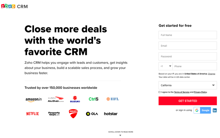
The Zoho CRM landing page is plain to direct attention towards the brands using the product and the signup form. Image source: Author
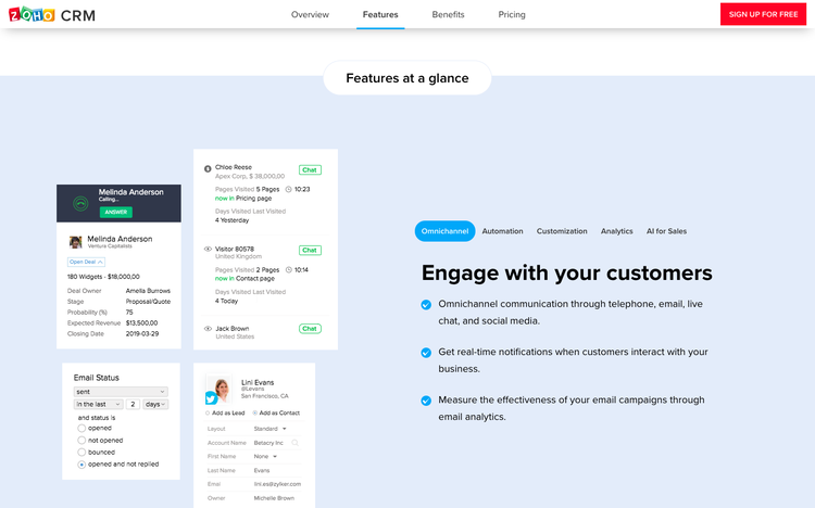
Scrolling down the page displays the most compelling product capabilities while keeping the call-to-action visible and available to access at the top. Image source: Author
This page starts off by highlighting Zoho’s status as a top CRM and backs that claim by displaying the names of highly reputable companies using the product, such as Amazon and Netflix. It then incentivizes you to sign up by offering the product for free. A plain white background avoids distraction and calls your attention to these aspects.
If that doesn’t convince you, product information highlighting the CRM strengths is available by scrolling down the page. When this happens, the landing page maintains its call-to-action, a red "sign up for free" button, at the top of the page.
Because investing in a CRM is a key business decision, the Zoho landing page delivers product information, such as benefits and pricing, in a simple navigation bar at the top of the page. This navigation bar only appears when you start scrolling down the page. Otherwise, it remains invisible and out of the way so as not to distract.
What you can take from Zoho:
Here are lessons to take away from Zoho CRM's landing page.
- Provide more info as needed: Some purchase decisions require careful consideration. In these cases, a landing page with minimal information can create customer frustration. Still, you don’t want to overwhelm landing page visitors with too much information either. To maintain the right balance, include only the most important information about your offering to help visitors feel comfortable acting on the call-to-action.
- Reinforce the call-to-action: When you must display a lot of information on a landing page, find a way to keep the call-to-action prominently visible. Zoho did this by having the call-to-action remain fixed at the top of the page while visitors scrolled through the information. That way, once a visitor has enough info to move on to the next step, the call-to-action is clearly marked for them.
6. Mailchimp
It’s time to employ the principles of marketing to your business. You come across the Mailchimp landing page and are intrigued, knowing an effective marketing technique is to build an email list and initiate an email marketing campaign.
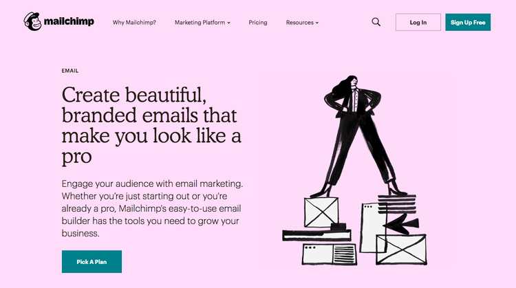
The Mailchimp landing page reinforces the company’s brand image. Image source: Author
The Mailchimp landing page highlights the ability to create branded emails in its ad copy. Mailchimp knows branding. Its mascot conveys a fun, quirky aesthetic, and its landing page reflects this brand through the imagery on the page and bright background color.

Navigating to other parts of the site present a consistent brand experience while maintaining prominence of the call-to-action. Image source: Author
The page encourages clicking on its call-to-action by including the word "free." It also promotes Mailchimp’s strength in helping your brand appear professional.
This landing page sports navigation options at the top because it’s part of Mailchimp’s larger website. While this risks creating distractions for visitors, Mailchimp’s approach works because the call-to-action consistently remains visible at the top of every page while delivering information a visitor needs to make a purchase decision.
Like the Lyft page, Mailchimp’s website incorporates responsive design, allowing it to work correctly across devices. This streamlines Mailchimp’s website marketing because the company does not need to build separate landing pages.
What you can take from Mailchimp:
These suggestions can help you integrate the lessons from Mailchimp’s example.
- Maintain a consistent brand: When using landing pages in your marketing, it’s common to use several pages, either to test changes or to fulfill different marketing objectives. Throughout the landing pages and across all marketing collateral, be sure to use a consistent brand, whether that manifests in the same color palettes or in visuals like Mailchimp’s quirky art. Doing so allows your business to stand out and be memorable in the minds of customers.
- Use your website with caveats: Using sections of your website as landing pages for your marketing makes perfect sense as a means of simplifying your marketing approach. However, the website must incorporate the characteristics of successful landing pages or this approach will fail. Mailchimp succeeds because the call-to-action remains visible and the information throughout its site keeps in mind the principles of user-friendly design.
7. JustAnswer
In the business world, growing your skills and wearing multiple hats is a requirement. Taking classes is a great way to expand skill sets, and in your educational search, you encounter JustAnswer’s landing page.

JustAnswer’s landing page presents you with a chat box inviting you to try its product. Image source: Author
This page presents you first and foremost with a chat box. JustAnswer’s approach is to throw you immediately into its offering. In this way, you sample its product and educate yourself about it at the same time.
Because of this, JustAnswer doesn’t need to describe the benefits of its product on the landing page. You experience it in real time, and then can judge its value for yourself.
To help you feel comfortable using its service, JustAnswer lists prominent news outlets, such as the New York Times, that delivered positive coverage of the company. Meanwhile, its simple statement of around-the-clock answers effectively highlights its primary benefit.
What you can take from JustAnswer:
Learn from JustAnswer’s approach by including these suggestions in your landing page.
- Leveraging chat: Providing chat functionality is a popular means of providing customer service today. But unless you have staff available or an automated system to respond in a timely manner, usually within a minute, it only serves to discourage customers. So if you’d like to add chat to your landing page, use chat software that can automate responses to your most frequently asked questions, but also be prepared to have staff jump in when needed.
- Provide customer testimonials: Because JustAnswer crowdsourced its tutors, prospective customers may doubt the quality of its answers. To combat this, JustAnswers included customer testimonials. Collecting customer testimonials for your site is a great means to build trust in your offerings for prospective clients.
Final advice about landing pages
These sales page examples demonstrate the range of options you can incorporate into your landing pages. The key to successfully implementing features of the best landing page examples is remembering to add web analytics and measuring results.
Through the use of these marketing analytics, you can boost the return on investment (ROI) of your landing pages. When you do that, landing pages help you achieve your business objectives.
Our Small Business Expert
Robert “Izzy” Izquierdo possess over 15 years of measurable success building and marketing multi-million dollar software products. Izzy is an expert in the disciplines of Software Product Management and Product Marketing, including digital solutions for Smart TVs, streaming video, ad tech, and global web and mobile platforms.
Share This Page
We're firm believers in the Golden Rule, which is why editorial opinions are ours alone and have not been previously reviewed, approved, or endorsed by included advertisers. The Ascent does not cover all offers on the market. Editorial content from The Ascent is separate from The Motley Fool editorial content and is created by a different analyst team.
The Motley Fool has a disclosure policy.