5 Ways Heat Maps Help Your Website
Whether or not you’re a data fiend, you’ll love heat maps. They’re used in many industries to gain insights.
Heat maps helped to analyze DNA and chart out terrain on other planets in our solar system. You can also employ them to make business decisions, such as with a market analysis.
I’ve managed many software products and leveraged heat maps in eye-tracking studies and to analyze website interactions. I embraced heat maps to better understand how customers used my products and improve the customer experience.
You can adopt heat maps for a similar purpose. Let’s explore how this useful tool can help your organization.
Overview: What is a heat map?
A heat map is a tool to help you analyze data. We’re visual creatures, and a heat map lays out data in a visual way.
It allows our brains to process information more effectively. It’s the difference between someone describing the Mona Lisa with words versus simply showing you the painting.
A heat map uses a color-coding system to show how data varies over a space. Orange or red colors represent higher data values (hence the hotter hues) than cooler blue or green colors.
For example, if you’re looking at a heat map of the Atlantic Ocean, red-colored areas show you where the water temperature is warmer than in blue-colored areas. That’s a lot easier to understand and analyze than a table of temperatures next to longitudes and latitudes.
Heat mapping software collects data. It then groups data points across a space, such as a webpage, using color-coding to help you understand how the data relates to that space.
The term heat map (or heatmap) refers to a specific class of data analysis. Various types of heat maps exist, providing different information. For example, a scroll map shows the percentage of website visitors who scrolled down a webpage.
A typical heat map looks like this. Image source: Author
What does a heat map do?
Use a heat map’s visualization capabilities to deliver insights for your business.
It’s particularly helpful when performing customer analytics. That’s because you need a significant amount of data collected over time to make an effective heat map.
Think of heat maps as a form of visual storytelling. A heat map tells you how visitors engage with your website. At a glance, you can immediately see where visitors clicked, and if they scrolled down your webpage.
You examine a heat map’s colors to understand intensity. Hot colors (such as red) flag the most popular webpage elements while cold colors (such as blue) tell you what’s ignored.
You can see where site visitors spent the most time or clicked the most based on these colors.
5 advantages of using a heat map on your website
Heat maps provide a data-driven method for decision-making. Given the information provided instantly by a heat map, using it for your website is a great way to ensure your site achieves its business goals.
Here are just some of the advantages conveyed by a heat map to help you strengthen your website.
1. Optimizes webpages
By understanding where site visitors spend time and click, you can make informed decisions, such as where to put the most important content on your site.
In my eye-tracking studies, website visitors consistently looked first at the top left corner of the page, then over to the right, then down the page. It’s the same pattern we use when reading a book.
Armed with this knowledge, you can make decisions such as placing a new product announcement on the top left part of your homepage, where it’ll get the most eyeballs.
A heat map is particularly useful before a website redesign. Using heat map data to identify areas on your site receiving visitor engagement, you can adjust the page contents to improve interactions on the elements you care about.
2. Increases conversions
Any time you want to improve how your website generates a conversion, use a heat map. If you want to boost sales through your website or encourage visitors to provide an email address to get them into your marketing funnel, a heat map points you in the right direction.
Heat map data reveals if visitors even see a form to fill out or your “buy now” button to click. This gives you the insight to rearrange webpage elements to increase the likelihood of the actions needed to deliver conversions.
3. Strengthens testing
As part of optimizing your website, you’ll want to execute testing. You don’t know if the changes you implement will help or harm. A heat map can assist with these tests.
A common testing methodology is A/B testing. You make two versions of the same webpage where the second version contains your change. After enough customers visit both pages, compare the heat map for each to gauge if the changed page led to superior results.
If website changes resulted in a decline, heat graphs show you where visitors redirected their attention. This helps you continue to evolve your testing in the right direction.
4. Improves communication
A heat map helps you communicate what’s going on more effectively to colleagues, managers, and other stakeholders. Showing a heat map spells out your points with its strong visuals.
It can also help you get buy-in for your business case. It’s hard for others to argue with the facts presented by a heat chart.
5. Flags issues
Heat maps identify challenges faced by your customers. If visitors aren’t converting the way you expected, the cause could be a technical issue.
Many businesses focus attention on the desktop version of their website, ignoring their mobile site. Many consumers use mobile devices instead of desktops, so problems on your mobile website can lead to lots of lost customers.
Avoid this by using a heat map on both mobile and desktop websites. You’ll find differences in user behavior between the two.
Perhaps mobile visitors aren’t seeing the checkout button because of the way your site appears on a mobile device. A heat map reveals users aren’t clicking or seeing it.
5 ways to interpret and use data from your heat map results
Heat map analysis is how you gain the information to improve your website. Here are five questions to ask as you kick-start your interpretation of heatmaps.
1. Are visitors seeing key content?
A business website houses a ton of information. You’re describing products and services, explaining your company on an About Us page, offering customer testimonials, and more.
Among this universe of content, some are more important to your business. Heat maps tell you if site visitors are even seeing this key content.
Perhaps visitors focus on content in the upper left of your webpage, but you want them to see content to the right. Switching that content’s position on the page can substantially increase results.
In the image below, the red area indicates the part of the webpage seen most by visitors. Notice how the bottom of the page shows no colors. This indicates few are looking at that part of the page. If important content is there, visitors are ignoring it in favor of the content toward the top of the page.

This heat map shows the webpage areas visitors focus on. Image source: Author
2. What actions are visitors taking?
You can quickly identify actions taken by your site visitors by looking at a click map. A click map is a type of heat map focused on highlighting where users clicked on a webpage.
Examining where clicks occur not only tells you what visitors are doing but also reveals how you can optimize a webpage to direct visitor actions toward the activities you want them to make.
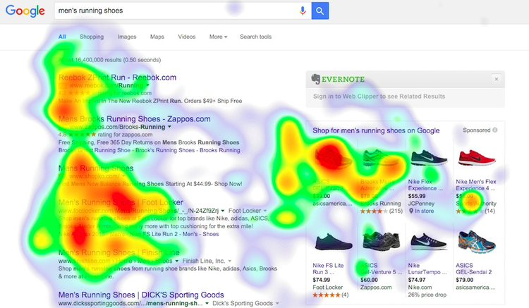
In the image below, the red areas show which of Google’s search results receive the most clicks. It makes sense the results at the top get the most and clicks decline as you go further down the page. Commonly, content toward the top of a webpage garners the most attention.
Note how the page splits into two sets of search results. On the left side, the first result at the top of the page received the most clicks compared to the search results below it. This is normally the case.
However, the results on the right side don’t follow the typical pattern. The second and third search results received more than the first as indicated by the intense red color.
This tells you the first result on the right is less relevant than the ones below for this particular search query. If this were your site, you could decide to move that first result on the right side further down the page in favor of more popular options.
This heat map reveals where visitors to this page are clicking. Image source: Author
3. Are visitors getting stuck or distracted?
Heat map data helps you identify where your website is failing your visitors and your business. If site visitors aren’t taking the actions you want, the heat map shows where they’re going instead.
It’s eye-opening to view your first website heat map showing visitor actions you didn’t expect. This can identify issues or help you prioritize how you arrange elements on a page.
Instead of reading what’s on your landing page, perhaps visitors are immediately trying to click on non-clickable elements, such as an icon that’s just an image.
This also informs you of the content they’re trying to get to, so make these elements clickable or rearrange content to help visitors focus on the actions you want them to take.
You may even want to remove distracting elements. If a heat map shows visitors engaging heavily with social media buttons but not your signup form, experiment with removing the distracting buttons to see if signups increase.
4. What other improvements should you make?
The priority with heat map data is to tackle improvements to the webpages that matter most to your business. After you’ve identified these, heat maps can point out additional areas where you may want to make changes.
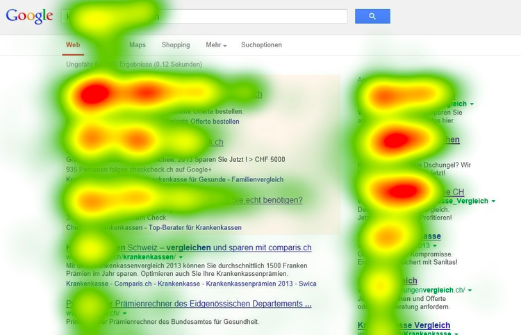
For example, the image below shows a scroll map. The yellow area indicates a drop-off in visitors scrolling down the page, declining as you go further down.
The drop-off is happening before visitors see the company’s available services. This data helps you identify content that failed to engage visitors, allowing you to make changes to encourage them to keep reading.

See where visitors stopped scrolling down your webpage. Image source: Author
5. Are your changes working?
It’s important to understand that heat maps are not a one-and-done solution. Continuous use and analysis come with the territory when you make changes based on heat map data.
For instance, you use a heat map to identify changes to improve newsletter signups on your site. After changes are live for at least a week (or longer if site traffic is low), take a look at heat map data again to see if you should make additional changes.
A last word about heat maps
Heat maps are a great resource. They can help you boost customer engagement, sales, and other business objectives. But they shouldn’t be your only tools.
Combine heat maps with surveys, customer interviews, and other analytics to grow your business more effectively. A heat map may show visitors are looking across your landing page but not clicking. A customer interview can help you get at why this is happening.
With heat map insights, you’ll be better prepared to get the most out of your business website.
Alert: our top-rated cash back card now has 0% intro APR until 2025
This credit card is not just good – it’s so exceptional that our experts use it personally. It features a lengthy 0% intro APR period, a cash back rate of up to 5%, and all somehow for no annual fee! Click here to read our full review for free and apply in just 2 minutes.
Our Research Expert
Robert Izquierdo is a software expert writing for The Ascent and The Motley Fool.
We're firm believers in the Golden Rule, which is why editorial opinions are ours alone and have not been previously reviewed, approved, or endorsed by included advertisers. The Ascent does not cover all offers on the market. Editorial content from The Ascent is separate from The Motley Fool editorial content and is created by a different analyst team.
Related Articles
View All ArticlesBy: Ben Gran | Published on Jan. 26, 2024
By: Steven Porrello | Published on Feb. 28, 2024
By: Ben Gran | Published on Feb. 27, 2024
By: Maurie Backman | Published on Feb. 27, 2024
By: Chris Neiger | Published on March 2, 2024