Published April 22, 2024
Project planning is tough, but it helps to have a visual framework to go off during the preliminary phases. PERT charts are the perfect solution for mapping out the project roadmap ahead.
There are two key factors that’ll thrust your project into the throes of success: good communication and good planning.
The first is accomplished by building a great report with your team through open channels of honesty, humility, and encouragement.
The second is brought on by organizational skills, team engagement, and foresight. While I’ve already gone into great detail in many of my other project management guides, I want to focus on planning. Particularly, one fundamental tool in your project planning arsenal: PERT charts.
What is a PERT chart?
PERT (program evaluation and review technique) charts are a graphical representation of a project’s timeline, tasks, and the dependencies between those tasks.
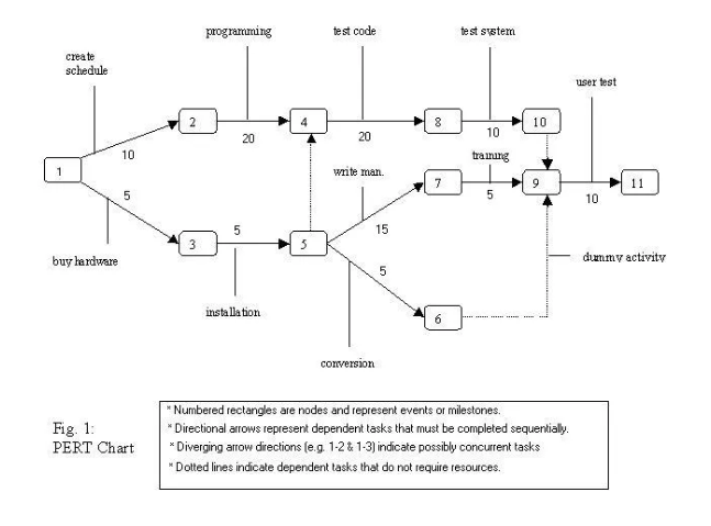
This is a very basic representation of a PERT chart. Image source: Author
These charts are used as a project planning tool for the purposes of establishing the amount of time it will take to complete your project, planning out who is responsible for each task, and aiding in finding a critical path.
PERT chart vs Gantt chart: What’s the difference?
This is a fair question since there are a fair amount of structural similarities between Gantt charts and PERT charts. Both Gantt charts and PERT charts display project tasks, show task dependencies, and help you identify your critical path.
In terms of visual differences, PERT charts are laid out as a network diagram that displays the order of tasks, while Gantt charts are shown as a horizontal bar graph. However, the biggest difference between the two is when they are used.
I’ve laid out a Gantt chart and PERT chart example comparison so you can understand the differences:
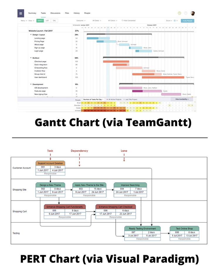
I gathered these to compare my PERT chart examples to a traditional Gantt chart. Image source: Author
PERT network charts are used during the planning phase of your project to map out your project and understand the process for completion, typically as part of a feasibility study.
A PERT chart will show how long it will take to deliver a project down to the individual task completion times, which tasks are connected to which, and who is responsible for those tasks. These charts are an essential ingredient for nailing down your project scope.
On the other hand, Gantt charts are used during the execution phase of the project management process.
These charts, used in conjunction with burndown charts, will lay out your project on a calendar timeline and show you exactly where you are along the process. Gantt charts are meant to be a task management tool rather than a project planner.
However, if your project management software lacks any PERT functionality, which many of them do, you can substitute a Gantt chart for your project planning.
When you should use a PERT chart for project management
If I’m being honest, you should always use a PERT chart or some other form of an organizational tool when planning out your projects.
That being said, there are times when you can get away with not using a PERT chart, like smaller personal projects that only require checklists.
However, there are two key instances when a PERT diagram is crucial for mapping out the way forward:
1. Your project has many simultaneously moving parts
PERT charts help make sense of the chaos when planning out complex projects. These are the projects that have multiple tasks in progress at one time that require specific completion windows and lots of different parties necessary to finish them. A PERT chart will help you understand which tasks are dependent on others and the order you must complete them.
2. You’re conducting a feasibility study
As I mentioned before, a PERT chart is typically employed as one of the potential tools in your feasibility study arsenal. This diagram is used not only as a visual structure for how your project is conducted but also as a guide for how long the project will take.
Since time is one of the core aspects of project feasibility, a PERT chart is the perfect tool for helping you determine whether your team can overcome this obstacle.
How to develop a PERT chart
Since your project almost certainly will benefit from the use of one of these diagrams, I’ve laid out six steps for successfully creating a PERT chart.
You’ll find the steps in this process are very similar to identifying your critical path, which is extremely helpful since these diagrams are one method for mapping out that path. More on that later.
Step 1: List out your project milestones and tasks
Milestones, or deliverables, are kind of like the checkpoints in a racing video game, and every turn, pass, or straightaway you drive are the tasks you perform to complete those checkpoints.
In order to create a PERT chart, you have to know all of the major milestones your team will have to accomplish and the tasks that’ll make that happen. List out these milestones and their individual tasks.
Step 2: Identify the sequence of those tasks
You’ve listed all of your milestones and tasks necessary to complete your project, so now it’s time to put those tasks into the correct sequence for completion.
While establishing this sequence and order of tasks, be sure to point out any task dependencies.
Step 3: Determine the time criteria for your tasks
This is the most technical step of the PERT diagram creation process. If you’re already familiar with the critical path method, you’ll know there are three specific time criteria you have to figure out for each task:
- Earliest start date/time (ESD/EST): This is the earliest possible time you can begin a task in your project. In order to determine the earliest start date or time, you have to understand all of your task dependencies inside and out.
- Earliest finish date/time (EFD/EFT): This is the earliest possible time you hope to finish a particular task. This is determined by adding up all of the previous dependent step times including the duration of this particular step you are attempting to measure.
- Time to complete: This is the duration of time you plan on spending to complete each individual task.
Once you’ve determined all three of these criteria and listed out the sequence of your tasks, you’re ready to create your PERT chart.
Step 4: Draw up your PERT diagram
You can create a PERT chart either by drawing one up yourself or by generating one using PERT software. The visual construction of a PERT chart isn’t tied just to the examples used above. PERT is more of a function, rather than a visual style of representing a project structure.
Create your PERT chart in whatever way makes the most sense to you, but just be sure to include all of the information you gathered in the previous steps in order to construct it.
Step 5: Draw out your critical path
Now that you’ve created your PERT chart with all of the relevant information, you can use this chart to identify the critical path of your project. Your critical path is the identification of the most important steps necessary that’ll help you determine the minimal duration of your project.
As an example, I created a PERT chart for my critical path method guide that maps out the critical path for grilling a steak:
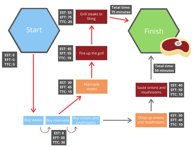
This is a simplified steak-grilling example of a PERT chart, but it demonstrates all of the necessary ingredients (pun intended). Image source: Author
In this PERT chart, I’ve used the earliest start time (EST), earliest finish time (EFT), and the time to complete (TTC) to identify the shortest possible finish time and draw out this critical path in red.
If I were to follow this basic critical path, I would have everything I needed to prepare and cook a steak successfully.
Step 6: Update your PERT chart as needed
Your PERT chart is a planning tool that is not set in stone. This diagram can be changed whenever circumstances are altered during the project execution phase.
Use your PERT chart as your initial roadmap for your project and transition over to a Gantt chart for the purposes of oversight and management.
The best project management software for PERT charts
It’s very rare for project management platforms to offer any sort of PERT functionality. As far as I’ve seen, all of the project management software options that I’ve reviewed haven’t included this feature and instead opt for users to use Gantt charts for their planning instead.
Don’t worry though; all is not lost. If you’re set on developing PERT charts using your computer, there are plenty of PERT chart generators out there for you to choose from. Here are some of the best PERT chart software options on the market today.
1. SmartDraw Chart Creator
SmartDraw is a cloud-based chart generation software that’ll work on both your desktop, Mac or PC, as well as your mobile phone, IOS and Android. This tool already includes several PERT chart templates that you can use to create the perfect diagram for your project.
Considering SmartDraw’s versatility, I’m not too concerned about the uninteresting presentation. Image source: Author
All you have to do is select a template and input your project data to create your PERT chart complete with all different kinds of symbols, numbers, and task flows.
2. Lucidchart
Lucidchart is a desktop-based chart creation software that seems to function more like Microsoft Paint than anything else. Luckily this makes it a very easy app to pick up and run with. All you have to do is click and adjust the shapes in your chart, add your information, and off you go.
If you’ve ever used any Microsoft tool in the past, you should have no problems learning Lucidchart. Image source: Author
What’s more, Lucidchart will integrate with some of the most popular office suite and project management software options on the market, such as GSuite, Microsoft Office, Jira, Slack, and many others.
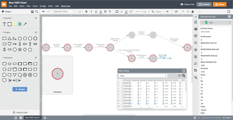
3. Creately
Last, but not least, we have Creately. This platform uses a simple drag-and-drop system for creating all kinds of organizational charts, including PERT diagrams. This tool combines many of the positive aspects of the last two options.
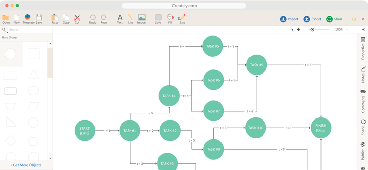
Out of these three options, Creately definitely has the best presentation. Image source: Author
When it comes to multi-platform use, Creately is available on Mac, Windows, Linux, IOS, and Android. As for integrations, it’ll sync with all kinds of other tools like Slack, GSuite, Jira, and Microsoft OneDrive.
The Ascent has far more to offer than just PERT charts
If you’ve stumbled on this piece about PERT charts, then chances are you know quite a lot about project management and you’re moving into the more advanced aspects of planning and execution.
Luckily, we have lots to offer you here at The Ascent, from project management principles guides to best practices lists. Be sure to check out everything we have to offer for project managers of all experience levels.
Our Small Business Expert
Nick is a seasoned writer and digital marketing specialist with lots of experience in B2B software research. He has always had a passion for technology and has worked as an Apple technical specialist, in the social media startup scene, and also in local DC real estate.
Share This Page
We're firm believers in the Golden Rule, which is why editorial opinions are ours alone and have not been previously reviewed, approved, or endorsed by included advertisers. The Ascent does not cover all offers on the market. Editorial content from The Ascent is separate from The Motley Fool editorial content and is created by a different analyst team.
The Motley Fool has a disclosure policy.