
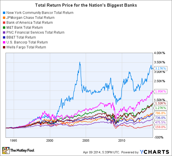
There are few banks in the country that can claim the same level of success as New York Community Bancorp (NYCB). Since going public in the mid-1990s, its stock has literally blown away industry peers, beating the next best competitor, U.S. Bancorp (USB 0.71%), by more than 1,000% after adjusting for dividends and buybacks.
What's made this possible? The answer can be found in three charts that cut to the heart of New York Community Bancorp's operations.
First and foremost, it doesn't underwrite bad loans. While this seems obvious, the reality is that no other multibillion-dollar bank has a track record that even comes close. You can see this in Figure 1, which compares New York Community Bancorp's net charge-off ratio to total loans -- in other words, this is the percentage of defaulted loans that are written off each year.

"When you think about what, in fact, distinguishes a bank as a lender," CEO Joseph Ficalora said last year, "it's how much money it loses on the asset that it chooses to take risk with." Needless to say, he's clearly got a point.
The second chart, Figure 2, is a bit more nuanced. This shows where the nation's biggest banks get the money they use to buy higher-yielding assets -- remember, banks are fundamentally nothing more than leveraged funds that arbitrage interest rates.

As you can see, most banks of comparable size rely on large bases of demand deposits -- namely, checking accounts. The benefit of these is that they don't accrue interest and thus, at least from this standpoint, are effectively free money. The flipside is that they require a large brick-and-mortar retail presence, which, in turn, increases a bank's operating expenses.
New York Community Bancorp, by contrast, gets less than 10% of its funds from demand deposits, the rest come from commercial funding sources and brokered deposits such as high-yielding CDs.
The downside to this approach is that it increases both the bank's cost of funds and its liquidity risk, as brokered deposits and commercial lines of credit are generally considered to be less stable than demand deposits. The upside, however, is that New York Community Bancorp has one of the lowest efficiency ratios, which measures operating expenses as a percent of net revenue, in the industry, allowing the bank to pass on more of its revenue to shareholders.
Finally, Figure 3 breaks down the equity balances of each of the nation's largest banks between common stock, preferred stock, and retained earnings. This shows the source of capital at each of these banks and also provides a hint as to the capital allocation strategies of the respective institutions. In New York Community Bancorp's case, virtually all of its equity consists of paid-in capital from common stock holders, versus, say, U.S. Bancorp, which has a massive reserve of retained earnings.

This suggests two things. First, that New York Community Bancorp has focused less on organic growth and more on a strategy of growth through acquisitions -- which, it's worth noting, isn't executed as adroitly by many other banks. And second, that the bank distributes almost all of its earnings to shareholders. In 2013, for instance, its dividend payout ratio was 93%.
Thus, at the end of the day, if you've ever wondered what makes New York Community Bancorp such a phenomenal success, these three charts should go a long way toward answering that question.


