Stocks charts are polarizing among investors focused on the long term. To some, using them is akin to reading the intestines of a goat to try to predict the future. For others, trend lines and support and resistance are very useful for picking entry points for a long-term investment or a short position. Finally, others use stock charts in their investing but in a truly contrarian way -- by loading fundamental metrics onto the chart.

Let’s go over each of the techniques discussed above and more.
Things to know when reading a stock chart
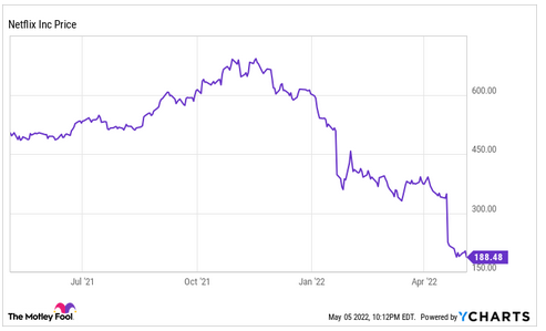
We’ll take a look at the most popular stock chart additions and use Netflix (NFLX -0.63%) stock charts as examples.
Price
You can’t have a stock chart without the stock price. The chart typically loads the closing price from each day and then plots a line across them. Sophisticated technical analysis charts sometimes use “candlesticks” and other shapes to show the movement throughout the day. The candlestick will show the high, low, open, and close prices on the day.
Date
Most stock charts are either for the past year or the year-to-date (YTD). Shorter-term traders often use charts that show daily or weekly movement, but, for long-term investors, there isn’t much to be gleaned from them.
Trends
“The trend is your friend” is one of the most common Wall Street sayings. A stock that is trending in either direction tends to keep moving in that direction. The more it goes up or down, the more investors pile in or pile out.
The most common trend lines added to the chart are the 200-day moving average (DMA) and the 50 DMA. The two time periods represent a year of trading days and a quarter. If the stock price is above them, it is trending up; if it is below them, it is trending down.
The most important thing to look for with trend lines is crossovers. When one line crosses over the other, or when one crosses over the stock price, it could signal that a change in trend is coming or has occurred. For example, many investors move part of their portfolio to cash when the S&P 500 price crosses below its 200 DMA.
This is also useful for shorting. Shorts are usually not meant to be long-term investments but are still useful for portfolio management. Using the stock chart to wait until the stock is in a downtrend can save you from losing a ton of money on growth stocks that just won’t quit going up.
You may also have heard of momentum. Where trends show you what direction a stock is moving in, momentum indicators tell you the speed it’s moving in that direction. The more you delve into momentum indicators, the further you move from long-term investing and into speculation and trading.

Support/resistance
Stocks tend to trade within ranges over the short term. They don’t go higher than the resistance level or lower than the support. Unlike the other terms we’ll go over, there are no support or resistance lines you can load onto a chart; you have to figure out what the levels are yourself. Look for the prices that the stock won’t go above or below recently.
Trend lines are often a good support level -- traders will buy if it gets close to one and keep it from falling below. Also, when a stock moves below a support level or above a resistance level, it is called a breakout. Trend crossovers are also breakouts.
Splits
Stocks split when the board of directors thinks the price is too high and lowering it would create more demand. The company increases the number of shares to keep the market cap the same. In a 2:1 split, the stock price would be cut in half and every owner would have twice as many shares. After a split, historical stock prices are automatically adjusted in the chart.
Dividends
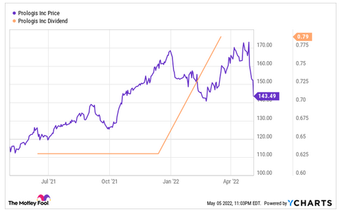
Dividends drive the price of income investments. The higher it is, the higher the price will go as income investors increase demand for the stock. We’ll use Prologis (PLD 0.69%) for a dividends example because it is a real estate investment trust (REIT) popular among income investors.
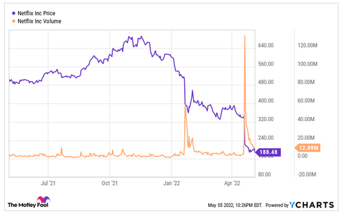
Volume
Volume is the amount traded in the stock each day. Big moves typically coincide with high volume days. If a stock’s volume is steadily increasing, it could signal a breakout that will be coming soon. Additionally, stocks with low volume may not be able to support their current trend.
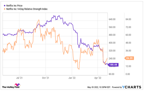
Relative strength
Relative strength is a way to measure whether a stock is overbought or oversold. When a stock is overbought, or overheating, it means so many new investors have bought it that the stock price has spiked to an unsustainable level and will likely drop soon. Oversold is the reverse.
Relative strength can also be used in growth investing. In the original The Motley Fool Investment Guide, David and Tom Gardner recommended only investing in stocks with high relative strength because that meant the market had caught on to the growth story.
Stock chart terms to know
The following terms are used every day by both long- and short-term investors.
Market cap
Market cap is the price it would take to buy an entire company. It is equal to the stock price multiplied by the total number of shares. Many investors prefer to use enterprise value, which is adjusted for the company’s cash and debt since a buyer would take on the cash and be liable for the debt.
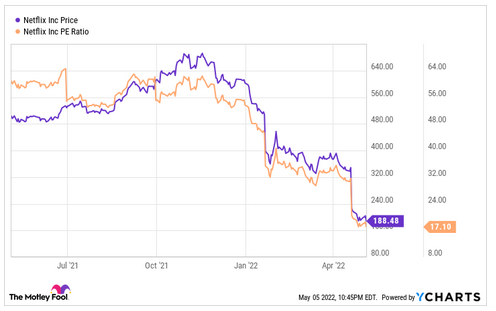
P/E ratio
The price/earnings (P/E) ratio is equal to the stock price divided by earnings per share. The ratio shows how many multiples of the annual earnings you pay for the stock. The lower the P/E, the more undervalued the stock. In a stock chart, the P/E will track the stock price (because it is derived from it) until a new quarterly report comes out and the P/E changes with new information.
Other useful multiples such as price/book, price/sales, or price to free cash flow can also be used.
Related Investing Topics
Dividend yield
Dividend yield is the stock’s dividend divided by the stock price. It shows you the percentage of your investment that will be paid back each year in dividends. Like the P/E ratio, it will track the stock price (but it will be inverted because the stock price is the denominator) until the dividend amount is changed.
The chart may also show the ex-dividend date. This is the date when you have to own the stock to have a right to the dividend. If you buy the stock after this date, you will not receive the dividend.