It was a theme often repeated during the presidential campaigns last year: Are you better off than you were four years ago? Now I ask, "Are we better off than we were five years ago?"
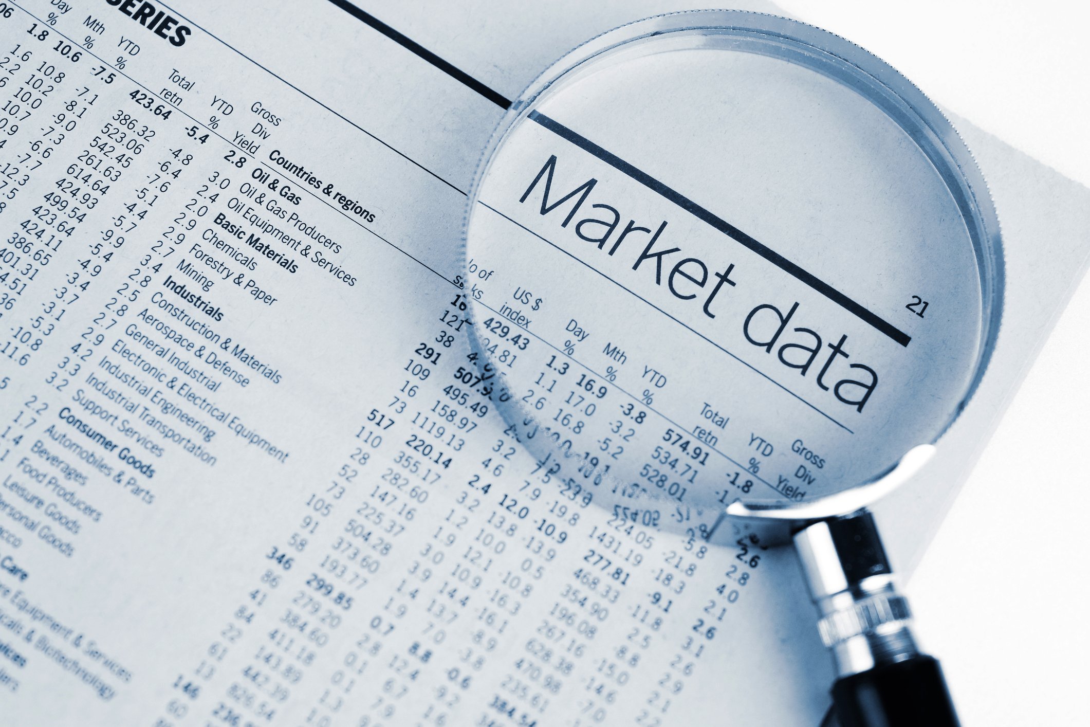
Wall Street seems to think so, with the broad-based S&P 500 (^GSPC +0.55%) finishing Friday at its highest level since Dec. 26, 2007. Having endured multiple European bailouts involving Greece, Ireland, Portugal, and most recently Spain, a just-ended seven-quarter downtrend in Chinese GDP growth, and many near-Congressional stalemates over the fiscal cliff and the debt ceiling, the S&P 500 continues to motor higher.
But again, I have to ask, "Are we better off than we were when the S&P 500 was around similar levels five years ago?"
To answer this question, I intend to look at multiple fields of data from as close to Dec. 26, 2007 as I can get and compare it to the most recent data we have today. My goal is to have this data encompass as many relevant economic parameters as possible, such as the labor force, effects on the consumer, government spending, and the like, and determine if we're actually better off now than we were when the S&P 500 was at a similar level in late 2007.
So, are we better off now? Let's find out.
Growth
- U.S. GDP Growth: Q4 2007 1.7% versus Q3 2012 3.1%
Based on GDP growth, we do appear better off than in 2007 by a full 140 basis points. Furthermore, 3.1% represents our second-fastest GDP expansion in the past 11 quarters. This would definitely support an optimistic market.
Prices
- Inflation rate: 4.1% in Dec. 2007 versus 1.7% in Dec. 2012
- Interest rate: 4.25% target rate in Dec. 2007 versus 0.25% target rate in Dec. 2012
- Crude oil spot price: $94.68 per barrel in Dec. 2007 versus $95.85 as of 01/18/2013
- U.S. dollar index: 75.50 in late Dec. 2007 versus 80.04 as of 01/18/2013
Here, things get a tad more mixed, but we're still overwhelmingly in the positive column that this rally is justified. A low inflation rate keeps more money in consumers' pockets (which ultimately allows them to buy more), while low discount rates spur banks to lend and businesses to take on debt and expand. Just last week, Goldman Sachs (GS +5.14%) reaped the benefits of record-low interest rates by reporting that net underwriting revenue more than doubled.
Spot oil prices are more of a toss-up, and I'm not seeing a clear advantage either way.
As for the dollar index, a higher level indicates an appreciating dollar, which makes it tougher for the U.S. to sell its goods overseas. Currency pressures are one of the primary reasons big corporations with a large international presence, like McDonald's (MCD 0.09%), have seen profits shrink when exchanging foreign currency into U.S. dollars. McDonald's third-quarter EPS was reduced $0.08 by currency translation alone. I'd say we aren't better off in this respect.
Source: TradingEconomics, Yahoo! Finance.
Labor
- Unemployment rate: 5% in Dec. 2007 versus 7.8% in Dec. 2012
- Labor participation rate: 66% in Dec. 2007 versus 63.6% in Dec. 2012
- Jobless claims: 335,250 four-week average Dec. 2007 into Jan. 2008 versus 359,000 average over the past four weeks.
- Wages: $10.01 per hour in Dec. 2007 versus $10.23 per hour in Nov. 2012
Make no mistake about it, these labor statistics definitely do not support this latest rally. Both the unemployment rate and labor participation rate signal that more people are out of work, for longer periods of time, and some are even giving up on finding work altogether. As one caveat, though, labor participation would be somewhat expected to fall as the country's population is aging and more people are retiring and dropping out of the workforce.
Both the jobless claims figure and wages I'm going to place in the toss-up column. It's difficult to pick a side based on the jobless claims figure because of seasonal hiring and firing, even if jobless claims are still tracking a bit higher now than five years ago. As for wages, although they've risen by 2.2% in nominal terms, they've underperformed inflation rates in real money terms.
Source: TradingEconomics, Bureau of Labor Statistics.
The consumer
- Disposable personal income: $10.82 trillion in Dec. 2007 versus $12.04 trillion in Nov. 2012
- Personal savings rate: 3.7% in Dec. 2007 versus 3.6% in Nov. 2012
- Consumer confidence: 90.6 in Dec. 2007 versus 65.1 in Dec. 2012
Focusing on the consumer will get us a little bit of everything. Clearly the most positive factor here is the $1.26 trillion rise in disposable personal income. With consumer spending accounting for roughly 70% of GDP, having more money available to purchase goods and services is a big plus for the economy.
Consumer personal savings rates I'm throwing in the toss-up column. Late 2007 was right around the time when personal savings rates began to rise as investors feared a popping of the housing bubble.
Consumer confidence, on the other hand, is most decisively negative and points to a dramatic deterioration in investor sentiment from where we were five years ago.
Source: TradingEconomics.
Housing
- Housing starts: 1,084,000 in Dec. 2007 versus 954,000 in Dec. 2012
- Case-Shiller index: 185.02 in Dec. 2007 versus 144.12 in Oct. 2012
Unsurprisingly, the housing sector continues to look noticeably worse now than it did five years ago, even after a precipitous year-long rebound. Some of the nation's hardest-hit homebuilders, like Hovnanian (HOV +0.73%), have been the quickest to rebound -- and with reason, as Hovnanian reported a 23% increase in net orders and is being paid a higher price of its homes by consumers, so its contracts are worth more. Yet the data above suggests that we were building more homes that were worth more (at least according to investors) back in late 2007.
Source: TradingEconomics, Standard & Poor's.
The government
- Government debt-to-GDP: 67.2% in Sept. 2007 versus 103% in Sept. 2011
- Government deficit-to-GDP: (2.1%) in Sept. 2007 versus (8.7%) in Sept. 2011
- S&P credit rating: AAA in Dec. 2007 versus AA+ in Dec. 2012
There's probably little explanation needed here, but these are not supportive figures for our latest rally. Years of trillion-dollar deficits have caused our debt levels to swell dramatically relative to GDP, all while government spending as a percentage of GDP has risen, and our credit rating has fallen -- at least in the eyes of Standard & Poor's.
Source: TradingEconomics.
The market
- S&P 500 P/E ratio: 21.5 in Dec. 2007 versus 16.9 as of 01/18/2013
- S&P 500 payout ratio: approx. 32% in Q4 2007 versus 29.1% in Q3 2012
- Bankruptcies: 28,332 in Q4 2007 versus 42,008 in Q3 2012
Yet again, more data that's all over the place. On a valuation basis, the S&P 500 is cheaper now at just 16.9 times EPS than it was five years ago, when it traded for more than 21 times earnings.
The S&P 500's dividend payout ratio might appear better in 2007, but that's a bit misleading, because payout ratios tend to rise quickly when business earnings go south, as was starting to happen in late 2007. I'm throwing this one in the toss-up bin!
Finally, business bankruptcies are markedly worse now than they were five years ago, although it's worth noting that bankruptcies as a whole are trending lower, not higher, at the moment.
Source: TradingEconomics, Irrational Exuberance, FactSet.
Time to tally the results
Based on current economic data in relation to where we were five years ago, we're actually in worse shape in many aspects. The U.S. government has mired the country under a mountain of debt, unemployment rates remain high, wages remain stagnant, and bankruptcy levels remain well above the norm.
However, there is one other interesting tidbit to take away from this exercise. In total, only five of the 20 data points indicated decisively that we were better off than in late 2007. But, if we were to rank the data chosen from most important to least important, I'd opine that the economic factors with the greatest clout -- such as GDP growth, inflation data, interest rate data, and consumer spending -- are all in support of a continued rally in the market. If both lending rates and inflation rates remain low, and consumers continue to spend more, then the S&P 500 could still head higher.
What this means for investors
Now for the nitty-gritty: "What does it all mean to me, the investor?"
I believe the takeaway, here, is that things aren't nearly as rosy as a five-year closing high on the S&P 500 would indicate. But, at the same time, the U.S. economy isn't about to fall off a cliff either, as the most important indicators are in better shape relative to where we were in Dec. 2007. Investors with a long time horizon probably have little to worry about, but I would nonetheless consider tempering your expectations of economic growth and stock market appreciation in the near term as I can firmly say, at least from a numerical basis, we aren't in better shape than we were the last time the S&P 500 was at this level.