A logo is a part of a company's mythos. Shape, size, color, typeface, white space -- all of it contains visual clues about the underlying brand's ethos. The best ones aren't only immediately recognizable, they also subtly nudge you into a buying decision.
Visualize the Coca-Cola (KO 0.34%) logo. Feeling thirsty? What comes to mind when you think about Apple's (AAPL 0.15%) bittten apple,the Nike (NKE +1.55%) swoosh, or the grin that underlines Amazon's (AMZN +0.06%) name.

To illustrate the power of logos two French filmmakers created an Oscar-winning animated short called Logorama featuring 2,500 corporate logos used as characters and backdrops for the action film. The filmmakers explained, "Logorama presents us with an over-marketed world built only from logos and real trademarks...Logotypes are used to describe an alarming universe (similar to the one that we are living in) with all the graphic signs that accompany us everyday."
Undoubtedly you'll recognize most of these symbols. Here's a closer look at some of the most powerful company logos out there.
Amazon's logo is all about friendly customer service, and more...
![]()
source:http://www.famouslogos.us/amazon-logo/
Although it looks simple enough, there's a lot going on in Amazon's (AMZN +0.06%) logo design.
Note the smile underneath the word. In a TED talk Ron Gutman, author of Smile: The Astonishing Powers of a Simple Act, noted a smile lights up your brain as if you had eaten 2,000 bars of chocolate, according to British researchers, and added, " A recent study at Penn State University found that when you smile, you don't only appear to be more likable and courteous, but you actually appear to be more competent."
The smile may also represent its reputation for friendly customer service and partly explain why the global e-tailer with a P/E at 1,281.21 is now a 100 bagger.
But there is actually another hidden message in the Amazon logo beside the beaming smile; the smile is also an arrow underlining and advertising the A-to-Z variety of merchandise at Amazon. Clever, right?
Nike's the swoosh conveys effortless speed
source:http://www.logoblog.org/nike_logo.php
The Nike swoosh -- one of the most recognizable logos ever -- was designed by an art student in 1971 for $35. Swoosh designer Carolyn Davidson didn't go away with just beer money. Twelve years after she submitted her bill, Nike founder Phil Knight gave her a swoosh ring and an envelope of Nike stock. Hopefully she held on to that stock: It has appreciated over 21,000% since 1983.
According to logoblog, "The Nike SWOOSH logo represents the wing in the famous statue of the Greek Goddess of victory, Nike, who was the source of inspiration for many great and courageous warriors. Legend has it that a Greek would say, "When we go to battle and win, we say it is Nike."
Nike, a five star CAPS rated stock, has leveraged the swoosh to become a $68.7 billion market cap company synonymous with athletic gear. It is trading at a 26.15 trailing earnings multiple with a 1.1% yield. The stock continues to perform well even in a challenged retail environment, up 60% over the last year.
Coca-Cola's secret formula isn't just it's soda pop recipe
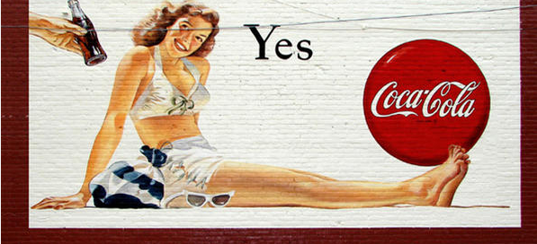
source: www.coca-colacompany.com
Companies usually spend much, much more to design or redesign logos. For example, PepsiCo spent $1 million on its logo redesign in 2008. In stark contrast, long-standing rival Coca-Cola spent nothing on its iconic logo. Zero. Zip. Nada.
It was designed in 1885 by Coca-Cola inventor John Pemberton's accountant, Frank Mason Robinson, who liked the idea of two ornate Cs in Spencerian script, which was the popular handwriting style of the time.source: www.coca-colacompany.com
"I think, by the end of their nightmare, they figured out who they really are. Caretakers. They can't change the taste of their flagship brand. They can't change its imagery [italics added]. All they can do is defend the heritage they nearly abandoned in 1985."
Of course, in the end, as powerful as logos are, it's the underlying business that determines a company's real value. It doesn't matter what wonderful logo a graphics whiz designs if the company doesn't offer value. Coca-Cola is a Dividend Aristocrat increasing its yield every year for 51 years, now at 2.9%. It is one of Warren Buffett's core holdings and you know the man recognizes a strong brand.
The Apple apple -- mysterious and revered

source:http://www.logoblog.org/apple_logo.php
Apple got a two-fer with its logo: It not only echoes the company name, but also happens to be a symbol recognized worldwide.
Its simple logo -- an apple with a bite out of it -- also conveys the simplicity of use of Apple products. And as Rolling Stone wrote, "Purposefully leaving the company's name out of the logo design has only made it that much more mysterious – and revered."
Consider that the Apple logo is the subject of conjecture with author Sadie Plant who theorizes that the apple was a nod to the inventor of modern computing, Alan Turing. Turing took his life with a poisoned apple. Others mention the bite out of the apple is a play on byte and bite.
The very first iteration of the Apple logo was an old fashioned version of Newton under an apple tree. The logo then morphed to the rainbow apple of whom Apple executive Jean-Louis Gassee said then, "One of the deep mysteries to me is our logo, the symbol of lust and knowledge, bitten into, all crossed with the colors of the rainbow in the wrong order. You couldn't dream a more appropriate logo: lust, knowledge, hope and anarchy."
It might sound like pretty high flown rhetoric, but the rainbow had to go when Steve Jobs returned to the company in 1997 and set out to help the company make some serious money. Cool, sleek products were the order of the day. The monochromatic apple symbolized the form following function sleekness of the new products that would would revolutionize personal computing, phones, and music. As a practical matter, the new logo was also easier to put on all the products.
Since 1998's debut of its last logo the stock has appreciated 15,000%. Now one of the largest companies in the world, Apple offers a yield of 2.3% at a trailing earnings multiple of 13.24.
The best logos only do so much for a company but they are clues to a company's mind-set and its goals. Brands and logos are intertwined parts of a business, especially for these four businesses. These globally growing brands just happen to deliver on the promise of their iconic logos.


