Published April 22, 2024
With online shopping now so common, your product page has never been more important. Learn how to build a best-selling page with these examples and best practices.
Online shopping has never been more common and its popularity isn’t expected to dwindle anytime soon. As the world struggles with COVID-19, we buy everything from groceries to clothing to appliances online. For businesses, this means their product page has become a vital part of the customer experience.
Think of a patron walking into your store. The digital equivalent is your product landing page. The goal is the same: make the sale before they walk away. Just like your physical store space, success comes down to how you display and promote the product and how easy you make the purchase.
We’ll cover the basic elements of an effective product page, view some great product landing pages, and discuss best practices to take your pages to the next level.
Overview: What is a product page?
The product page, or product landing page, is the foundation of e-commerce. It tells your customer what you’re selling and why they should buy it. This starts with a product name and description.
A clear name and product description tell the customer they’re in the right place. Use straightforward, accurate terms to describe the product, remembering the keywords people use when searching.
For example, Baby Jogger sells the City Select Stroller. Since “convertible stroller” is a common search term, they include it in the product description.
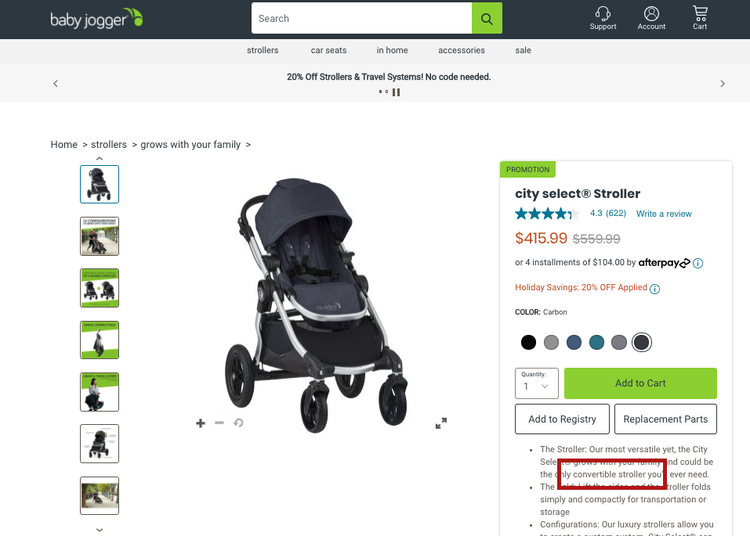
This Baby Jogger product page includes relevant keywords and several images. Image source: Author
This Baby Jogger page shows another important element of a good product landing page: images. Images help users visualize and fall for a product, and are a major part of online store marketing. Include multiple images showing the item from different angles and demonstrating different features.
The final basic elements of a product page are the price and conversion button, e.g., Buy Now, Add to Cart, etc.. Display the call to action (CTA) prominently with a colored button. Making your CTA button hard to find is as senseless as forcing a customer to search for a checkout register.
4 stellar product landing page examples
Now that we’ve covered the building basics, let’s view some of the best product landing pages. These businesses apply persuasive e-commerce strategies to increase sales.
1. The Sill
The Sill began as an online store, offering houseplants, pots, and other plant accessories. They’ve opened some brick-and-mortar stores, but their sleek product page design shows online shopping can still give a sense of place and reflect your brand.

The Sill’s product pages have a clean design that reflects their brand. Image source: Author
"We think everyone deserves to have their own personal plant oasis," The Sill explains. The page’s clean design and informative product description make "plant parenting" seem both desirable and achievable.

The Sill includes plant care instructions on their product pages. Image source: Author
One of the best ways to market a product online is to give a taste of how the purchase will make the customer feel (calm, sophisticated, grounded), but also address purchase barriers. The short Plant Care section is there to convince people with little experience or disastrous experience caring for plants.
2. Fenty Skin
Fenty Skin is a skincare brand created by rockstar Rihanna, but you don’t have to be a celebrity to apply lessons from her product website to your business.

Fenty Skin’s product pages provide information important to buyers of skincare products. Image source: Author
Your product page can call out special features of your product or address common questions. Below the Add to Bag button, Fenty Skin uses icons that fit their aesthetic, telling customers their product is cruelty-free, vegan, and recyclable. Don't bury selling points in a wall of text. Icons make them more eye-catching.

Users can find detailed product information without leaving the page. Image source: Author
Some customers prefer the nitty-gritty details so Fenty Skin provides them. The scrolling box gives shoppers additional information such as ingredients and instructions, right on the page, without obscuring the Buy Now button.

As you scroll down the Fenty Skin product page, it suggests complementary products. Image source: Author
If users do scroll down, however, they find the Plays Nice With section, which suggests other products the shopper might like. Don’t just make it easy for customers to buy the product they want. Show them other products they didn’t know they needed.
3. ThirdLove
ThirdLove sells stylish bras through their online store, but since bras fit differently on different bodies, ThirdLove offers images of two models of different sizes.

ThirdLove provides several high-quality product images on their product pages. Image source: Author
Bras are notoriously difficult items to shop for, so returns and exchanges are important to customers. Recognizing that, ThirdLove shows their shipping, returns, and exchanges policies on the same page as their products.

ThirdLove uses several elements on the product page to encourage customers to add to their purchase. Image source: Author
To encourage more purchases, ThirdLove suggests other items that will complete the look. This subtle encouragement, combined with their “Free shipping over $75” message in the menu bar, and “Bundle & Save” option, show how small design elements can lead to larger purchases.
4. Lowe’s
Home improvement retailer Lowe’s uses product page elements to persuade buyers to purchase a single, more expensive item.

This Lowe’s product page tells users the low price is temporary. Image source: Author
A power tool at $400, for example, seems a lot less pricey when customers see the original price was $769.00.

The product price is more appealing when users see it is heavily discounted. Image source: Author
Whatever products you’re selling online, emphasizing the savings of a price drop is a powerful persuasive tool, especially if that price will end soon.

Telling shoppers an item is low in stock creates scarcity. Image source: Author
This product page also shows another way to influence customers to buy now. Just above the brightly colored Add to Cart button, users see the message “Hurry, Low in Stock.” This scarcity message nudges buyers to complete the purchase.
4 best practices for creating effective product pages
The examples above show the most basic elements of a product landing page to influence users to buy now and buy more. The following best practices will make your pages even more effective.
1. Address what matters to your customers
Effective product websites don’t just showcase the product, they talk to their customers' needs and concerns. You always contend with your audience’s questions and barriers to purchase, which depend on your product and audience.
The Sill knows lack of plant care know-how prevents some from buying. So they offer product-specific plant care recommendations and informational blogs relevant to the product.

To help customers feel confident buying plants, The Sill offers informational blog posts. Image source: Author
Fenty Skin knows customers want to buy ethically created, cruelty-free products. To address allergens, another big concern, the product page displays a gluten-free icon and lists product ingredients.
Consider common customer questions and why buyers hesitate. Address those obstacles on the product page, and your pool of potential buyers will be much bigger.
2. Use reviews and other social proof
Social proof refers to the fact people decide based on the experiences and endorsements of others. Reviews and word-of-mouth matter.
Your ability to incorporate reviews will depend on your e-commerce platform, but use positive feedback to your advantage. Five-star reviews are powerful, but so are a couple of quotes singing your praises.

Fenty Skin uses customer images from social media on their product pages. Image source: Author
Fenty Skin also leverages social proof through social media. Scroll down their product page, and you'll find Instagram customer pictures. Whether starred reviews, selfies, or customer quotes, social proof assures shoppers real people love your products.
3. Help shoppers find the right product
The biggest challenge isn’t always convincing someone to buy but helping them find the right product. Matching the customer with the right product moves them toward a purchase and increases the likelihood they will be happy with the purchase.

ThirdLove helps shoppers find the right product with a short quiz. Image source: Author
ThirdLove uses a Fit Finder which helps customers find the right bra with a short quiz. Women struggle to find a well-fitting bra -- this tool makes it easier.
Even a simple sorting functionality will improve the customer experience to find a product that fits both their needs and their budget.
4. Create a sense of urgency
Convincing shoppers to buy is important, but showing why they should buy now is essential. They may want your product, even bookmarking it, intending to buy later. But they get distracted and never finish the transaction. Or maybe they plan to look somewhere else for a similar product.

This Lowe’s product page tells users this low price will end soon. Image source: Author
You need to create a sense of urgency when a shopper lands on your product page. Lowe’s accomplishes this by indicating a sale will end soon or product stock is low.
Create urgency by reminding customers of a holiday for which they may want the product or release a limited number of the item. Scarcity and deadlines encourage shoppers to click the “Buy” button while they can.
Best practices for best-selling product pages
The product page is your greatest opportunity to communicate value and influence shoppers. Explain all your best features and alleviate customers’ concerns and doubts. By providing foundational information and simplifying the buying process, you set yourself up for more sales and more satisfied customers.
Our Small Business Expert
Allison Gauss is an experienced writer with work appearing on sites such as HuffPost, GEN, and the Stanford Social Innovation Review. Having worked at multiple software startups, she has also provided nonprofits of all sizes with instruction in fundraising, branding, donor engagement, and more. When she's not writing, Allison likes to make music and perform improv comedy.
Share This Page
We're firm believers in the Golden Rule, which is why editorial opinions are ours alone and have not been previously reviewed, approved, or endorsed by included advertisers. The Ascent, a Motley Fool service, does not cover all offers on the market. The Ascent has a dedicated team of editors and analysts focused on personal finance, and they follow the same set of publishing standards and editorial integrity while maintaining professional separation from the analysts and editors on other Motley Fool brands.
The Motley Fool has a disclosure policy.