Published April 22, 2024
A number of factors, depending on industry and goal, go into making a small business website great. These are some of our favorite small business websites.
Good small business website design does not just focus on one element; it is a puzzle that encompasses the site build, content creation, and user experience, all working in tandem to create an attractive website primed for traffic and conversions.
While big enterprises certainly have a litany of resources at their disposal, from the money for custom builds to robust catalogs of ever-changing content, killer company sites can also be found in the small business ranks.
Small business sites (SMB websites) can be just as creative and utilize a lot of the features built into their content management system (CMS) software to produce unique company websites.
You don’t have to invest a ton of cash to build something special if you design smartly and keep the end goal (retention, conversion, etc.) in mind as you go.
Attention to detail, storytelling, and great photography are what make the following some of the best business websites around, small or otherwise.
1. Scaling Retail: Content and visual branding
Scaling Retail is a retail consultancy that understands the importance of content and visual branding.
The navigation is clean and intuitive, while the homepage opts for a full-screen hero image that grabs the eye and “shows rather than tells” the industry Scaling Retail specializes in -- fashion.
It also smartly features recent awards in a noticeable yet understated fashion to emphasize the agency’s work value.
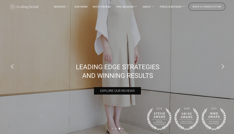
Impactful and strategic imagery placement makes a statement while showing the business' purpose. Image source: Author
Scaling Retail also makes smart use of landing pages as actionable resources, namely for downloading industry white papers.
These lead magnets are attractive to prospects while collecting email addresses for the company to then feed into newsletters and other email marketing campaigns.
The homepage is easy to navigate, and the biggest and most important call to action, the act of booking a consultation, is highlighted as an easily clickable button. Because the lifeblood of a service-based small business is signing new clients, this is an excellent use of a call to action.
2. Solana: Visual storytelling
Solana produces ethical footwear and leans into the storytelling aspect of its brand.
The homepage starts with a large image showcasing the product (great!), but it also has a carousel slideshow that smartly makes the most of the header space to highlight multiple product shots and various calls to action, including the elevation of key brand ideals such as conscious production and artisan talent.
The company also takes a unique approach by using one of the slides to solicit stories from its website visitors, which is an eye-catching and attractive way to build community and capture contact information for promotions.

A smart, multi-use slideshow header is efficient and stands out. Image source: Author
Solana also draws attention to its small text banner announcing “Free Shipping,” which is a great nudge toward conversion. A minimal menu design keeps the homepage clean and gives weighted importance to each section.
3. Rendall Co.: Brand recognition
Mask and workwear producer Rendall Co. features its press mentions right on the homepage in a noticeable banner, with a white type set against an eye-catching black background.
This strategy gives the brand credibility and reputability in a relatively new field, personal protective equipment (PPE). Rendall Co. also includes a press section in the main header, making finding trusted sources easy for website visitors.

Highlighting trusted partners and press inspires brand acceptance. Image source: Author
4. Blue Agave: Cohesive aesthetics
Mexican eatery Blue Agave is all about ease of use and aesthetics. It took full advantage of its CMS design capabilities and made the entire homepage scrollable from top to bottom to access several main points, including location, contact and order delivery details, and information about the company.

Tempting pictures and clear, pertinent information make this homepage a winner. Image source: Author
Especially in a pandemic-ravaged world, highlighting delivery opportunities upfront is a great way to drive traffic.
Brand-cohesive artwork is strategically placed throughout the site, creating an aesthetically pleasing experience without distracting visitors from the important content -- menus, catering, hours, online ordering, and delivery information.
5. Alexis Russell: Eye-catching video marketing
Ethical and arty handmade jeweler Alexis Russell knows that its product is eye-catching, so it features a full-screen, embedded video (above the fold) showcasing its shimmering rings.
The jeweler even used web design functionality to make the top navigation menu opaque, so it doesn’t cut off the product header block's full-screen effect.

Embedded video and pristine production quality really stand out. Image source: Author
If you linger on the homepage, you get a newsletter popup, which is an excellent tool to collect prospects' and customers' information for marketing.
As you browse the menu, the collections are sectioned off by jewelry type and easily sortable by price, feature, etc., to improve browsing. Thus, more purchasing is likely to occur.
6. Vicky Bakery: Personalization and community building
Small bakery chain Vicky Bakery knows that location is key to its business. It highlights location search on the front page and has a feature that lets you save your preferred bakery.
The company also has links to its social media accounts right on the homepage, which encourages community building and helps the bakery stay engaged with its social media followers.

For brick-and-mortar stores, ease of location is everything. Image source: Author
Vicky Bakery also knows that photography is especially important in creating a desire for its product (delicious baked goods). It utilizes image editing to move beyond typical square image templates and layers the images to stand out even more.
7. Valani: Attention-grabbing email marketing
Sustainable clothing brand Valani creates an inviting site that leans into email captures and gets creative with those features.
An embedded video in its newsletter popup is not something you see every day, so it grabs more attention. Valani also offers 10% off for signing up for the newsletter, which is an attractive trade to encourage email signups.

A cohesive brand palette and interesting video stand out to shoppers. Image source: Author
Valani also utilizes the left side of the website to feature a promotion button such as a discount or giveaway. As webpage sides tend to go untouched, this is a superb attention-grabber, thanks to its unique nature, and a testament to thinking outside the box with web building.
8. House of Intuition: Niche marketing and community building
House of Intuition, a provider of metaphysical services and products (healing crystals, herbs, candles) grabs attention with hero text that affirms your website visit: “Your intuition led you here.” It is a great example of truly knowing its customer demographic, as the whole site is designed to appeal to a particular niche.
Narrowing down demographic focus is vital in the competitive e-commerce world. As you shop, you can browse by category or theme, making filtering relevant products that much easier.
The top banner uses emojis to catch visitors’ eyes, while a 20% off promo code is highlighted, encouraging purchases on the site from the very first line of text. The company also expands on being an e-commerce site by highlighting learning and education, which cultivates a community interested in learning more.

Knowing when to prioritize copy is a smart design move. Image source: Author
House of Intuition also leaned into accessibility by embedding a menu button that brings up options for browsing the site for the visually impaired.
Inclusivity is not only a good look ethically but it is smart from a business sense as it opens the site to more customers.
9. Sports Science Lab: Content upgrades
When you visit the Sports Science Lab, you are greeted with an embedded video highlighting its athletes and processes. A timed popup prompts you to sign up to receive a complimentary assessment.
Complimentary content upgrades are excellent, attention-grabbing tools that help you collect customer emails (for sales and promotions) from a lead magnet.

Capturing attention with a complimentary offer is a savvy marketing choice. Image source: Author
Sports Science Lab also knows its service is unique, so it has categories in the top navigation menu for prospects looking to learn more.
Killer web designs can totally be small business-friendly
Since there are so many small businesses with creative website designs, this is an instance where size doesn't matter. And you don't even have to be a coding genius to build a unique site for your small enterprise.
Thanks to the user-friendly yet highly customizable nature of many of today's content management systems, you can optimize your site for SEO, design eye-catching graphics, capture emails, highlight promotions, embed video, and much more, all in the pursuit of producing a truly great small business site.
Our Small Business Expert
Rose Wheeler is a seasoned writer and content manager with more than 15 years of experience. She specializes in content related to digital marketing, small business, personal finance, and CMS. Her work has appeared on sites such as Selz, The Cheat Sheet, and Swaay. When she's not working with her awesome clients, Rose enjoys cooking, playing games and curling up with a good book.
Share This Page
We're firm believers in the Golden Rule, which is why editorial opinions are ours alone and have not been previously reviewed, approved, or endorsed by included advertisers. The Ascent does not cover all offers on the market. Editorial content from The Ascent is separate from The Motley Fool editorial content and is created by a different analyst team.
The Motley Fool has a disclosure policy.