Published April 22, 2024
While writing this I am also currently helping my girlfriend finalize the work on her master’s dissertation before her submission date this week. This sixty-page behemoth has been an incredible task for her to overcome, and I am just so proud of what she has accomplished.
However, there were many times where it was impossible for her to see the light at the end of the tunnel with all she had to compile in order to make sense of her argument.
This uncertainty created nothing but anxiety for her because she wasn’t sure if she could finish in time (rest assured, we both know she will now) since there wasn’t a clearly defined endgame for it. How much information was enough? Was the analysis clear enough? Did she have enough supporting material?
Once she was able to make sense of these questions, the path forward was clear, allowing her to chip away at this dissertation piece-by-piece on a regular schedule.
Despite this progress, I wish I had recommended to her that she use a burndown chart in order to make sense of her progress while writing it.
Overview: What is a burndown chart?
In simplest terms possible, a burndown chart is a visual representation that shows how quickly a team is completing a project’s stories, epics, or tasks.
A “story” is an agile term for what end-users see as a project progresses, not to be confused with a “task” which is a project directive that is only visible to the project team.
This chart is used throughout the execution phase of the project life cycle and will show how much work has been completed compared to the projected amount of work that should be completed at a specific point in time.
This type of chart is typically used in conjunction with agile project management methodologies, particularly scrum, but once you understand the project management basics, it also can be used with most other types.
Burndown charts work best so long as accurate calculations have been made while creating a work breakdown structure and using the critical path method.
Without accurate work calculations, you will skew the burndown chart, which will lead to either too many or too few tasks designated to your team at one time.
How to read a burndown chart
A typical burndown chart will show the amount of work represented on the vertical axis of the chart, while the horizontal axis represents a length of time, typically the beginning and end of a project.
Finally, there are two lines on the chart that show the ideal amount of work that ought to remain at a certain point in time and the actual amount of work left.
In order to give you a better idea of what a burndown chart would look like, I’ve created this simplified example:
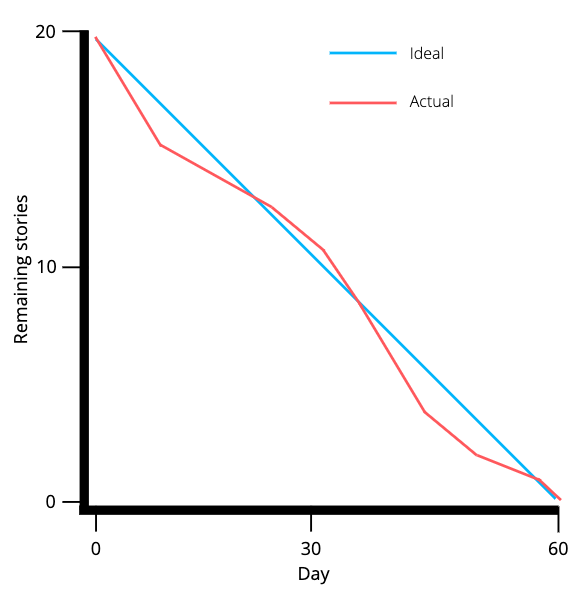
Most burndown charts won’t have a straight line for the “ideal,” but this works for simplicity’s sake. Image source: Author
In this sample burndown chart, you can see that the blue line represents the ideal amount of stories that ought to be completed at certain times, while the red line represents the actual number of stories.
At certain points, the team was able to get ahead of schedule, while around the midway mark they found themselves struggling to meet expectations.
Why you should use a burndown chart
Burndown charts are handy because they provide additional insight into your team’s productivity, so long as your work estimates are accurate.
However, if you’re looking for additional justification, I’ve listed three benefits for using these reports as part of your project management plan.
Risk reduction
The burndown chart is the perfect tool for deriving quick feedback on what is working and what isn’t when executing a project. This way your team will be able to act quickly when issues arise rather than waiting for timeliness to become a bigger issue down the line.
Accountability
It’s one thing to talk about your progress, and it’s another to see your progress on display with hard numbers and a chart to back it up. It’s harder to confuse the progress of your work when the data is right in front of you.
That’s not to say that the data doesn’t also need context, but it is helpful to have a visual reminder there to keep your team accountable and provide motivation to stay on or ahead of schedule.
Efficiency
Burndown charts allow your team to view a visual representation of their progress and timeliness. This can save time, such as during meetings when trying to figure out whether or not the project will fall behind.
Burndown charts in project management software also automatically provide real-time updates for project progress as tasks and/or stories are completed, saving project managers the time spent creating these charts.
The best project management software for burndown charts
Now that you have a fundamental understanding of what a burndown chart is, what it is used for, and the benefits of adopting one as part of your strategy, why not make the creation process that much easier?
Sure, you could devise one on paper before each meeting, but it’s much simpler to let your computer do most of the work. That’s why I’ve listed three of the best project management software options for creating burndown charts.
1. Jira
One of my favorite things about Jira is the ability to shape your project to fit your methodology right from the start, including agile and scrum.
This means Jira includes burndown charts in its reporting capabilities and it’s one of the easiest project management tools for creating them.
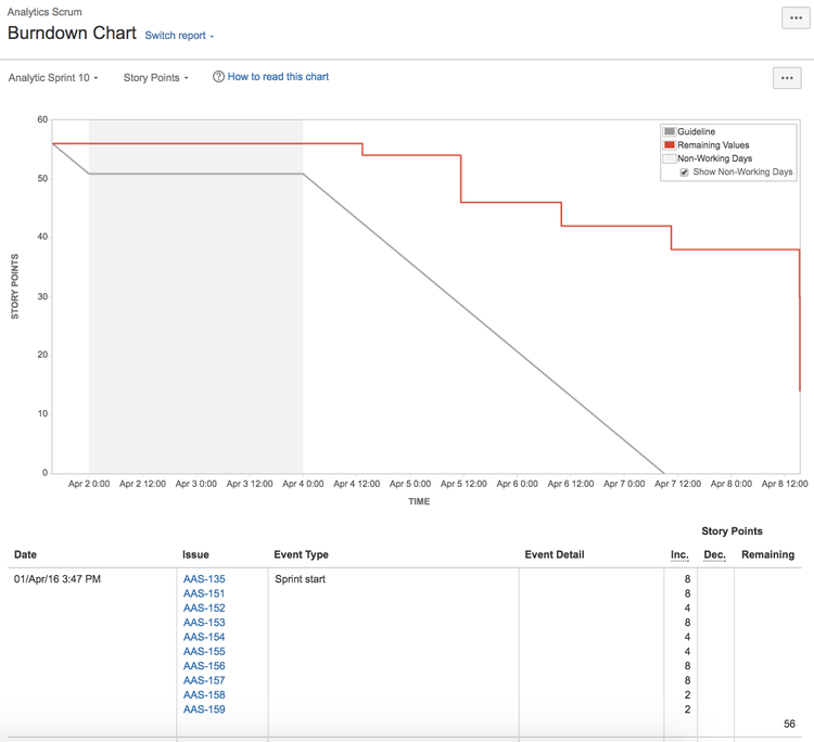
Jira’s burndown charts may be simple, but so is the setup process for creating them. Image source: Author
Jira offers two types of burndown reports:
- Epic burndown chart - This report will show how your team is progressing against the work scheduled in an epic, a work item that includes multiple tasks.
- Sprint burndown chart - On the other hand, this report will show how your team is progressing against the work scheduled within the specific timeframe of a sprint (typically two weeks).
Creating these charts won’t require any additional tweaks to your project so long as you’ve operated within the agile or scrum templates offered by Jira, making this an extremely convenient option for burndown reports.
2. Trello
In all of my years using Trello, I never got the chance to witness or use its burndown functionality until now. This functionality doesn’t come standard with your Trello subscription and instead must be installed using Trello “power-ups.”
That being said, Trello has the most appealing burndown charts of the three options in this list.

Trello’s burndown capabilities are simple and perfect for those who are new to using burndown charts. Image source: Author
This application connects to your Trello account and provides you with additional settings to set time and work parameters so you can create simple burndown charts for your Trello boards.
The burndown chart operates using sprints only instead of coupling its functionality with epics like Jira.
3. Microsoft Project
Finally a chance for this platform to shine. After everything I’ve said about Microsoft Project in the past, this tool came through where many others fell short. In true Microsoft fashion, it’s not an easy process creating a burndown chart using this platform, but the final result is detailed and thorough.

Microsoft Project’s burndown charts aren’t as pretty as Jira’s and Trello’s but are still highly functional. Image source: Author
Microsoft Project allows you to create two different types of charts:
- Work burndown charts - These show how much work has been completed, how much is scheduled before the finish date, and the baseline that establishes the ideal amount of work done at any point in time.
- Task burndown charts - These charts are similar to work burndown charts, but the data is shown in individual tasks, making for a more intricate burndown.
Creating these charts will require adjustments to your project, mostly when it comes to creating new specific data fields. However, the linked guide above will walk you through the process of creating both types of burndown charts.
Burndown charts aren’t the only tool for measuring success
Burndown charts are critical for measuring your success while executing a project, but what about predicting the success of a project beforehand or measuring that success after completion?
Here at The Ascent, we’ve put together countless guides, software reviews, and alternative pieces that’ll help you come out ahead in every phase of your project from ideation to submission.
Our Small Business Expert
Nick is a seasoned writer and digital marketing specialist with lots of experience in B2B software research. He has always had a passion for technology and has worked as an Apple technical specialist, in the social media startup scene, and also in local DC real estate.
Share This Page
We're firm believers in the Golden Rule, which is why editorial opinions are ours alone and have not been previously reviewed, approved, or endorsed by included advertisers. The Ascent does not cover all offers on the market. Editorial content from The Ascent is separate from The Motley Fool editorial content and is created by a different analyst team.
The Motley Fool has a disclosure policy.