If the trailing two years have taught investors anything, it's that Wall Street can be fickle. We witnessed the timeless Dow Jones Industrial Average (^DJI 0.40%), broad-based S&P 500 (^GSPC 1.02%), and growth-stock-dominated Nasdaq Composite (^IXIC 2.02%), climb to multiple record-closing highs in 2021, plunge into a bear market in 2022, and now bounce strongly during the first half of 2023.
Volatility of this magnitude can be enough to push some investors to the sidelines, while others are left to question when it'll end and where stocks are headed next.
Truth be told, there is no such thing as a perfect economic indicator or market metric that'll always correctly predict what's going to happen next with the stock market. There are, however, indicators and metrics with phenomenally strong track records of forecasting the future. One such bull market indicator offers a pretty big clue as to where stocks are headed for the remainder of the year.
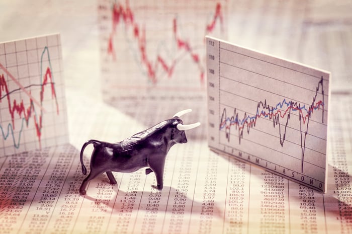
Image source: Getty Images.
This bull market indicator has only been wrong four times in 73 years
During the first-half of the year, the stock market crushed many of the loftiest analyst projections. As of the closing bell on June 30, the Dow Jones Industrial Average had gained 3.8%, the S&P 500 was higher by a cool 15.9%, and the Nasdaq Composite had risen by a whopping 31.7%. It's been something of a lopsided rally powered by large-cap growth stocks and industry leaders.
By one line-in-the-sand definition, the S&P 500 and Nasdaq Composite have officially entered a new bull market. Both indexes have rallied more than 20% off of their 2022 bear market lows, which to some investors signals the beginning of a fresh bull market.
But what's particularly interesting is how the benchmark S&P 500 has historically performed in the second-half of the year following a double-digit gain through June.
S&P 500 up >10% the first 6 months?
-- Ryan Detrick, CMT (@RyanDetrick) July 2, 2023
July and the next 6 and 12 month returns are much better than avg.
Also, the past 11 times this happened, the next 6 months where higher every single time. pic.twitter.com/LtgWgIQRwU
As you can see in the tweet above from Chief Market Strategist Ryan Detrick of Carson Group, there have been 23 years since 1950 where the S&P 500 has produced a first-half return of at least 10%. This includes the aforementioned 15.9% return this year, through the end of June.
While the S&P 500's performance in July has been hit-or-miss over the previous 22 instances where the benchmark index gained 10% or more through June, the data is pretty clear what happens most of the time in the six remaining months of the year. In 18 of 22 instances (82%), the S&P 500 closed out the year even higher than where it finished in June. The average return in the second-half of the year following a 10% or greater increase during the first half is 7.7%.
Furthermore, as Detrick points out, the last 11 instances where the S&P 500 has gained at least 10% through June led to a green second half of the year. Based on 73 years of history, the "new" bull market may have legs.
Money may be the thorn in Wall Street's side
Between Carson Group's overwhelmingly bullish dataset, strong U.S. job growth, and corporate earnings handily surpassing expectations during the first quarter, it might seem like a no-brainer that stocks are pointing higher. But if you follow the money... literally... you'll find a different story.

US M2 Money Supply data by YCharts.
Last week, I laid out the potentially unnerving correlation between declines in U.S. M2 money supply and deflationary recessions. M2 money supply includes everything in M1 (coins, cash, and demand deposits), as well as savings accounts, money market funds, and certificates of deposit (CD) below $100,000. In other words, it's available capital, but not money you have sitting in your pockets or in a checking account.
When back-tested to 1870, there have only been five instances where M2 money supply has declined by at least 2%, and four of them led to big downturns in the U.S. economy. Four of these instances occurred a long time ago: the Depression of the 1870s, Panic of 1893, Depression of 1921, and Great Depression. To be fair, the Federal Reserve now has more than a century of economic know-how to lean on when adjusting monetary policy, which means it's highly unlikely we'd see a depression in modern-day America.
The fifth instance of a meaningful decline in M2 money supply, and the first since the Great Depression, is happening right now. As of May 2023, M2 was 4.1% below its all-time high set in July 2022. While this could be nothing more than a benign drop following a historic surge in M2 during the COVID-19 pandemic as a result of multiple rounds of fiscal stimulus, it could also be a precursor to economic weakness.

US Commercial Banks Bank Credit data by YCharts.
Commercial bank lending data provides a potentially ominous warning, as well.
Over the past 50 years, commercial bank credit has been rising at a relatively steady pace. That's because the U.S. economy expands over time, and banks need to cover their expenses associated with taking in deposits.
However, there have four separate occasions over the past half-century where commercial bank lending dipped more than 1.5% from its record high. In three of these instances (1975, 2001, and 2009-2010), the S&P 500 shed around half of its value. The fourth instance is ongoing, with commercial bank lending 1.47% below its all-time high as of the latest reading (June 21, 2023), and 1.95% below, as of June 7, 2023.
What this data tells us is that banks are being cautious and tightening their lending standards as interest rates rise. That's typically indicative of slowing economic activity.
This bull market indicator is 104 for 104 since 1900
Based on Carson Group's dataset of the past 73 years, the needle is very clearly pointing higher for Wall Street. But according to a couple of important money metrics, additional downside in the Dow, S&P 500, and Nasdaq Composite seems more likely. It's these conflicting datasets that makes predicting short-term moves in the market, with accuracy, so difficult.
But what if I told you there was a bull market indicator that's been a perfect 104 for 104 since 1900?

Image source: Getty Images.
For years, market analytics company Crestmont Research has been publishing and updating a dataset that examines the rolling 20-year total returns, including dividends paid, of the S&P 500. Even though the S&P didn't come into existence until 1923, and it didn't take its modern-day 500-company format until 1957, Crestmont was able to back-test its dataset to 1900 given that many of the same companies were found in other prominent indexes at the time. This gave it 104 rolling 20-year timelines to work with (1919-2022).
What Crestmont's dataset showed is that all 104 rolling 20-year periods would have produced a positive total return. Regardless of whether an investor hypothetically piled into an S&P 500 tracking index at a short-term peak or managed to invest during a bear market swoon, they made money as long as they were patient and held their position for 20 years.
What's more, the vast majority of the rolling 20-year periods examined produced inflation-crushing results. Whereas you can count on one hand how many of the 104 ending years led to an annualized total return of 3.1% to 5%, over 50 of the end years yielded annualized returns ranging between 9% and 17.1%.
The cherry on top, courtesy of data from Bespoke Investment Group, is that the average bull market has lasted about 3.5 times longer than the average bear market since 1929 -- 1,011 calendar days vs. 286 calendar days, respectively.
Regardless of what the short-term data suggests, Wall Street's track record over the long run is undefeated.


