Image source: Getty Images.
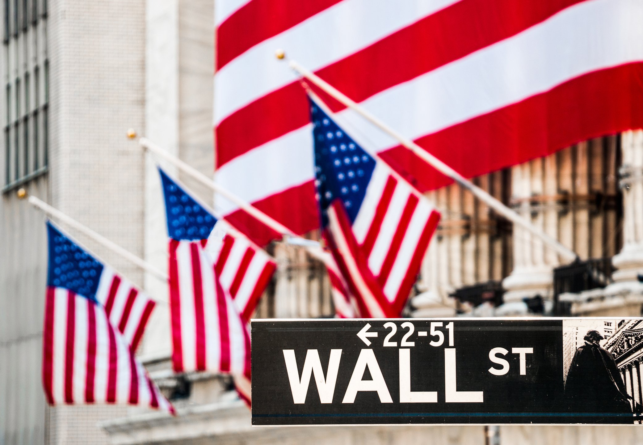
After nearly two months of waiting, the iconic Dow Jones Industrial Average (^DJI 0.17%) has finally eclipsed the vaunted 20,000 mark. For Wall Street and investors, Dow 20,000 represents a major step forward for the U.S. economy and the stock market. It firmly places the Great Recession in the rearview mirror and reaffirms that the multiyear bull market is still well intact.
Dow 20,000 is also a potential feather in the cap for both the outgoing Obama administration and the incoming Trump administration. Rising stock prices, especially since the election in November, could imply that investors are confident that the U.S. economy is on the right track. Considering that U.S. GDP growth came in at 3.5% in the third quarter, the fastest growth rate in two years, there could be some merit to that idea.
Then and now: comparing Dow 10,000 to Dow 20,000
But, there have also been some pretty sizable changes in the U.S. economy, and for consumers, since the Dow last hit a five-digit milestone – that being when it first touched 10,000 on March 29, 1999. Here's a quick side-by-side comparison of a few of the intriguing differences between Dow 10,000 in 1999 and Dow 20,000 today.
- Price for a gallon of gas: $1.12 (1999) vs. $2.44 (2017)
- Price for a barrel of oil: $14.36 (March 1999) vs. $53.18 (2017)
- Price per MMBtu of natural gas: $1.85 (1999) vs. $3.34 (2017)
- 30-year fixed mortgage rate: 6.98% (1999) vs. 4.06% (2017)
- Unemployment rate: 4.2% (March 1999) vs. 4.7% (Dec. 2016)
- Number of Starbucks stores worldwide: ~ 2,500 (1999) vs. ~ 24,000 (2017)
- Walt Disney World ticket price: $42 (1999) vs. $110 for regular ticket (2017)
- Number of internet users worldwide: 248 million (1999) vs. 3.68 billion (Sept. 2016)
- Average U.S. home price: $119,600 (1999) vs. approx. $204,500 (end of 2016)
- U.S. postage stamp cost: $0.33 (1999) vs. $0.47 (2017)
- Gold price per ounce: $280.10 (1999) vs. $1,200.50 (2017)
- Silver price per ounce: $5.10 (1999) vs. $16.97 (2017)
- McDonald's Big Mac: $2.50 (1999) vs. $3.99 (2017)
- New York Yankees box seat ticket price: $50 (1999) vs. $100 to $190 (2016)
- Movie ticket price (adjusted for inflation): $5.08 (1999) vs. $8.65 (2016)
A lot has changed. Amazingly, the unemployment rate has actually gone up, and mortgage rates have come way down thanks to years of dovish monetary policy from the Federal Reserve. Also, some prices, as you can see, have gone through the roof. The price for a gallon of gasoline has more than doubled, and gold is up more 300% on a per-ounce basis since March 29, 1999.

Image source; Getty Images.
One thing that hasn't changed
However, one thing that hasn't changed between Dow 10,000 and Dow 20,000 is that both figures are meaningless milestones in the grand scheme of things.
Think about it this way: The Dow Jones had hit 17 separate new all-time highs since the election without hitting Dow 20,000. Were any of these new highs celebrated by Wall Street? If you guessed "no," you're essentially correct. All eyes on Wall Street have instead been arbitrarily focused on Dow 20,000 while ignoring the multiple new all-time highs the iconic index surpassed along the way.
The other issues with Dow 20,000 euphoria is that it ignores the natural tendency of the stock market to head higher over the long-term, and it sweeps the inherent flaw with the Dow Jones under the rug.
Historically, the stock market tends to gain about 7% annually, inclusive of dividend reinvestment. This means the major stock indexes tend to double in value about once every decade, and that the natural trend of high-quality stocks over the long-term is to head higher. Of course, sometimes it takes longer than others for major indexes to hit arbitrary milestones. It took the Dow only three years and five months to head from 5,000 to 10,000. However, it took more than 17 years for the Dow to move from 10,000 to 20,000. Once again, these are arbitrary figures I'm using for illustrative purposes only, but if you'd have bought stocks at regular intervals over the past 17-plus years, chances are that your average buy in would have you up in excess of the 100% return in the Dow between March 29, 1999, and Jan. 25, 2017.

Image source: Getty Images.
Focusing too much on the Dow Jones's achievement also overlooks the inherent flaw of the Dow: its focus on price instead of market cap weighting. Unlike the widely followed S&P 500 which has a numerical value that's determined by market cap weighting, numerical movements in the Dow are based solely on the changing price of its 30 components and a Dow denominator.
Right now, every $1 move in the 30 Dow components translates into approximately 6.87 Dow points. In other words, companies with a high share price have far more importance than those with lower share prices, regardless of market cap. This means Goldman Sachs, with its $237.25 share price, currently accounts for about 1,630 of the Dow's 20,069 points, while Apple, which is nearly seven times the market cap of Goldman Sachs, comprises about half as many Dow points with a $121.88 share price. That's pretty crazy, and a major reason why the Dow has lost some of its precedence as a leading index.
My suggestion? Stick to your strategy of buying high-quality companies over the long-term and pay little attention to the white noise created by milestone euphoria. All that should matter to you is that the companies you own are effectively hitting on all aspects of their growth strategies, and that your investment thesis still holds water.