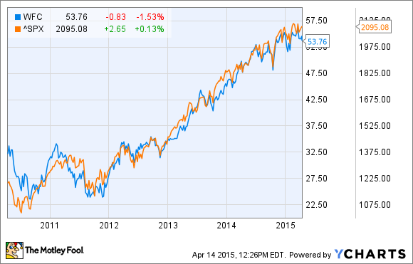
Wells Fargo & Co. (WFC +0.40%) on Tuesday gave a mundane set of earnings results that led to a slight stock sell-off in early trading. The bank has been in the news for its recent agreement to buy performing loans from the real estate arm of GE Capital. In a sense, the GE deal highlights the need to purchase loans in a difficult lending environment. As a consequence of that environment, Wells Fargo's stock slightly underperformed the S&P 500 over the last five years.
With that said, let's look at the development of the bank's underlying metrics.
Wells Fargo reports first-quarter results
Income before income tax expense -- pre-tax income to you and me --declined by 2.3% in the quarter, and it's not hard to find the culprit. Noninterest expense rose much more than net interest and noninterest income, with 48% of the $559 million increase in noninterest expense coming from increased commission and incentive compensation.
| Q1 2014 | Q1 2015 | Change | |
| Net Interest Income after credit loss provision | 10,290 | 10,378 | 1% |
| Noninterest Income | 10,010 | 10,292 | 2.8% |
| Noninterest expense | 11,948 | 12,507 | 4.7% |
| Income before income tax expense | 8352 | 8163 | (2.3)% |
This is clearly a sign that Wells Fargo isn't finding it easy to generate income in a low interest rate environment.
Net interest margin and net interest income
The following chart of net interest margin, or NIM, and net interest income illustrates the difficult nature of the current environment. The NIM is simply the difference between the bank's interest income and the interest it pays to its lenders -- a higher number is good. But Wells Fargo's number has fallen in recent years, and consequently the bank has found it hard to increase net interest income.

Source: Wells Fargo Presentations. All figures in millions of U.S. dollars unless stated.
Core deposits and total loans
As the following chart shows, Wells Fargo has had little problem receiving deposits from customers, but its total loan book hasn't grown in proportion. In fact, the amount of loans at quarter-end actually fell sequentially in the first quarter.

Credit loss provisions and net interest income
Investors should also look for how increasing credit loss provisions are reducing profitability. As the following chart makes clear, Wells Fargo's credit loss provisions (red line) are rising again after a substantive fall to the third quarter of 2013. This helps you understand why net interest income after credit loss provision (green bar) is growing slower than net interest income (blue bar).

Source: Wells Fargo Presentations. All figures in millions of U.S. dollars.
Mortgage banking income and noninterest income
Probably the most positive aspect to the results was that mortgage banking income (red line) rose year over year after a few quarters of declines. It contributed $37 million to the overall total noninterest income (blue line) rise of $182 million, but proved a minimal offset to the $559 million increase in noninterest expense (green line). Essentially, low interest rates have spurred extra mortgage activity, but how much longer can this last?

Source: Wells Fargo Presentations. All figures in millions of U.S. dollars.
The takeaway
All told, this was a fairly routine report that highlighted the tepid nature of lending activity right now in the U.S. It also highlights the importance of Wells Fargo acquiring loans from GE Capital and other companies. Going forward, keep an eye out for (hopefully) some sort of pickup in lending activity in banking
