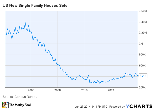
This week, the Commerce Department released its December housing market report, and the numbers widely disappointed market observers. Newly constructed single-family home sales declined 7% from November, coming in at a seasonally adjusted 414,000 homes.
What does this report mean to you? As always, monthly reports should always be taken with a grain of salt; one month does not make a trend. But diving into these charts will help you read the tea leaves of where the housing market is, and more importantly, where it's going.
The 10-year trend: New home sales
Let's start by taking a step back and observing the performance of new-home sales over the past 10 years. The immediate observation is just how outrageous sales were back in 2004-2006. But looking at the trend over the past four to five years shows that December's numbers are not materially outside the pattern. The bullish trend beginning in 2011 still seems to be intact.
Sales are relative. Let's look at inventory.
To evaluate the number of sales, we must also consider the inventory available on the market. Sales are an indicator of demand; inventory is supply.
In this chart, we can clearly see a strong seasonality to inventory in the housing market (this seasonality has been adjusted out of the preceding sales chart). But even with the cyclical gyrations, the long-term trend is still obvious. Supply is declining, but it could be nearing a stable level.

We have established that sales, from a trend perspective, are stable and slowly increasing. Inventory is declining but may be nearing a stable level. What does this mean for us as investors and market observers?
Understanding the intersection of supply and demand
When evaluating the real estate market, it's not enough to review sales and inventory independently. Understanding how these indicators interact is the best way to truly assess the direction of the market -- we need to find where supply and demand intersect.
To do that, we can view a ratio called the "months' supply of inventory." If there is one ratio to understand in real estate, this is it.
In a stable market, this metric for new homes will be somewhere between four to nine months. This means that with current sales and current inventory, the market currently has enough houses to last four to nine months.
If this number moves lower, it indicates that inventory is low and that prices will likely rise unless there is an influx of new homes. If the number moves higher, it indicates there is an oversupply based on demand, and prices will fall.
The real scale of the real estate meltdown can be seen in this chart, but what's more significant today is that the ratio of supply and demand remains in the range of a stable market. This is a great sign for builders -- it means prices will remain stable and that current market dynamics should continue. This is a great sign heading into the spring selling season.

Recent history tells the story for homebuilder stocks
Bringing it all together, this final chart shows the stock price of two major homebuilders -- PulteGroup (PHM +0.81%) and Toll Brothers (TOL 0.15%).
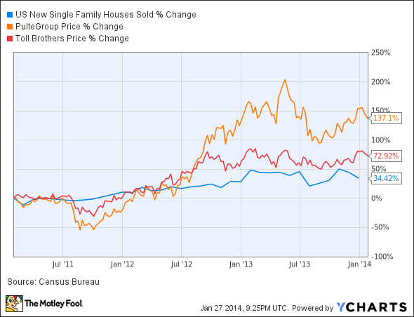
Bringing these charts all together, we show that the long-term trends remain intact, supply and demand are still balanced, and homebuilder stock prices don't really correlate to short-term movements in the housing market. And so, we can conclude that for investors in residential single-family real estate or in homebuilders, the weak December numbers are, well, irrelevant.