When the curtain closed on 2023, Wall Street and everyday investors had plenty of reason to cheer. The 127-year-old Dow Jones Industrial Average (^DJI -0.02%) climbed to a record high last year, while the benchmark S&P 500 (^GSPC 0.47%) and growth stock-powered Nasdaq Composite (^IXIC 0.94%) catapulted by 24% and 43%, respectively.
But a new year brings new questions for investors. Topping the list: Where will stocks head next?
Although there's no such thing as a forecasting tool that can, with 100% accuracy, predict directional moves in the Dow Jones, S&P 500, and Nasdaq Composite, there are a couple of predictive indicators that have strongly correlated with movements in the three major stock indexes throughout history. One such indicator, which hasn't been wrong for the past 58 years, has a potentially ominous warning for investors.
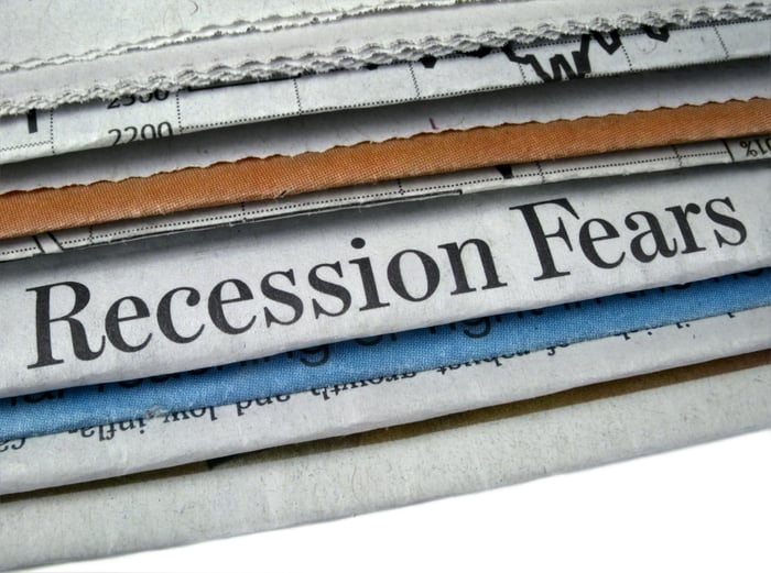
Image source: Getty Images.
This recession-forecasting tool hasn't been wrong since 1966
While there is no shortage of metrics investors are using to try to gain an edge on what might happen next with the stock market, it's the Federal Reserve Bank of New York's recession probability tool that appears to offer the biggest clue.
The New York Fed takes into account the spread (i.e., difference in yield) between the 10-year Treasury bond and three-month Treasury bill to determine how likely it is that a U.S. recession will take shape within the next 12 months.
Normally, the Treasury yield curve slopes up and to the right. In other words, bonds that mature a long time from now will sport higher yields than bills set to mature in mere months. The longer your money is tied up in a security, the higher the yield should be.
Trouble arises when the Treasury yield curve inverts. A yield-curve inversion, where short-term T-bills have higher yields than longer-dated T-bonds, signals concern about the U.S. economic outlook. Although not every yield-curve inversion is followed by a recession, every recession following World War II has been preceded by a yield-curve inversion. Think of it as a necessary "ingredient" to a potential downturn in the U.S. economy.

US Recession Probability data by YCharts. Gray areas denote U.S. recessions.
Every month, the New York Fed updates its recession-forecasting model. As you can see in the chart above, the steepest inversion of the Treasury yield curve in more than four decades has pegged the probability of a recession taking shape by or before December 2024 at 62.94%.
To be fair, the Treasury spread has incorrectly forecast a recession once before. In October 1966, the probability of a U.S. downturn briefly surpassed 40%, but no recession ever materialized.
But since 1966, the New York Fed's forecasting tool has been as trustworthy as the sun rising in the east. If the probability of a U.S. recession has surpassed 32% since 1966, a recession has, without fail, always followed. Considering that the currently probability of an economic contraction is nearly 63%, the writing appears to be on the wall that a recession is in the cards for 2024.
Even though the U.S. economy and stock market aren't linked at the hip, corporate earnings usually decline during a recession. Furthermore, approximately two-thirds of the S&P 500's drawdowns since the Great Depression have occurred after, not prior to, a recession officially being declared. In simple terms, stocks would be expected to perform poorly if a recession arose this year.
But wait -- there's more
Interestingly enough, the New York Fed's recession indicator isn't the only worrisome correlation attached to the nation's central bank. The Federal Reserve's monetary policy can also offer big clues as to what's next for stocks.
The Fed's "monetary policy" describes the actions it takes to maximize employment and keep the prevailing rate of inflation at modest levels over the long run. Though the nation's central bank has a handful of tools at its disposal, the most common means to effect change is through the federal funds rate.

Effective Federal Funds Rate data by YCharts.
A declining interest rate environment is usually viewed favorably by investors since it encourages lending, which can be used by businesses to hire, acquire, and innovate. Conversely, a rising-rate environment can be seen as putting the brakes on a growing economy. However, this comparison isn't quite as cut-and-dried as it seems.
The nation's central bank doesn't reduce interest rates on a whim. Historically, it lowers the federal funds rate when clear signs of trouble have emerged. As much as lower interest rates might seem attractive to investors, they've typically been a harbinger of poor performance to come for Wall Street.
Since this century began, the Fed has kicked off three rate-easing cycles, which began in January 2001, September 2007, and July 2019. Following these initial rate cuts, it took the S&P 500 645 calendar days, 538 calendar days, and 236 calendar days, respectively, to find its bottom.
In 2024, the Fed is forecasting three rate cuts. Although not every rate-easing cycle throughout history has been bad news for Wall Street, recent history suggests trouble lies ahead.

Image source: Getty Images.
Patient investors are still sitting pretty
Based on the latest round of data from the New York Fed's recession indicator, along with the performance of the major stock indexes following the start of rate-easing cycles since 2000, there doesn't seem to be a lot for investors to smile about. However, perspective changes everything on Wall Street.
Since World War II ended in September 1945, the U.S. economy has navigated its way through a dozen recessions. Just three of these 12 downturns reached 12 months in length, while none of the remaining three surpassed 18 months. By comparison, two periods of expansion over the past 78 years have lasted at least a full decade. The key point is that that economic expansions handily outpace recessions over long periods.
This disproportionate optimism is also seen when examining the length of bull and bear markets for stocks.
It's official. A new bull market is confirmed.
-- Bespoke (@bespokeinvest) June 8, 2023
The S&P 500 is now up 20% from its 10/12/22 closing low. The prior bear market saw the index fall 25.4% over 282 days.
Read more at https://t.co/H4p1RcpfIn. pic.twitter.com/tnRz1wdonp
Last June, the researchers at Bespoke Investment Group released a dataset comparing the average length of bull and bear markets in the S&P 500 dating back to the start of the Great Depression (September 1929). Whereas the average bear market stuck around for a modest 286 calendar days (about 9.5 months), the typical bull market lasted 1,011 days, or approximately 3.5 times as long.
Furthermore, even though there have been 39 double-digit-percentage declines in the S&P 500 since the start of 1950, every notable drop, save for the 2022 bear market, has been decisively wiped away by a bull market rally.
We're never going to know ahead of time precisely when downturns will begin, how long they'll last, or how steep the decline will be. But history is crystal clear that bull markets eventually push the Dow Jones, S&P 500, and Nasdaq Composite to new highs. This effectively means that every pullback in the major stock indexes represents a surefire buying opportunity for patient investors.
Regardless of what 2024 holds in store for the U.S. economy and the stock market, patient investors will be sitting pretty.


