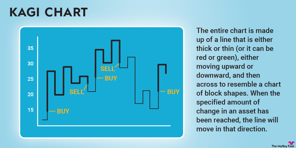
Both technical traders and the technically curious should seek to understand as many types of charts as possible so they have a wide variety of ways to analyze their data. A Kagi chart is just one of many technical charts that can show you something significant about the price of assets, if you're paying attention.

Investor studies financial charts.
Investor looks at chart.

Definition

What is a Kagi chart?

A Kagi chart is a technical chart that shows changes in the price of assets such as stocks or futures contracts. They aren't concerned with time, so they only track major changes as defined by the person making the chart, eliminating a lot of visual noise.

Typically, a Kagi chart will either track changes in the price of an asset or security by a firm dollar amount, a percentage change, or based on an average true range, which is a measure of volatility. However, because it's a chart built to be blind to time, it's important to interpret Kagi charts alongside other types of technical charts.

How to interpret

How to interpret a Kagi chart

Kagi charts are built exclusively to show significant changes in the prices of assets. The entire chart is made up of a line that is either thick or thin (or it can be red or green), either moving upward or downward, and then across to resemble a chart of block shapes. When the specified amount of change in an asset has been reached, the line will move in that direction. For example, if it goes up by a specified $10, the line will go up and become thick if the movement breaches a prior high, and or it will become thin if it breaches a prior low.

There are several trade signals associated with a Kagi chart, including shoulders, waists, rising shoulders, falling waists, and the three-Buddha bottom (which is similar to an inverse head and shoulders pattern).

Kagi vs. candlestick charts

Kagi charts vs. candlestick charts

Candlestick charts show the highest, lowest, open, and closing prices for each trading day, so they also eliminate a lot of noise for investors, but they're not the same as a Kagi chart. A Kagi chart shows much less, only reversing direction when there's been a significant and predefined change in an asset's price.

Candlestick charts are also time-bound, adding more information to the chart. A Kagi chart removes that element, only indicating a change when the threshold has been reached, and doesn't add additional noise for small or quickly reversed changes to a price. It's very useful for cutting through the clutter, but this is also why you can't use a Kagi chart alone.

Related investing topics

Why they matter

Why Kagi charts should matter to investors

Kagi charts can show a technical investor where opportunities lie, but it takes time to really dial them in. For example, if a chart with a specified $10 change works well to show buying opportunities for XYZ, Inc., you can't take that same threshold and apply it to ABC, Inc. You'll have to recalibrate for ABC, Inc., and this can become both challenging and frustrating if you're not a purely technical trader.

On the other hand, by using Kagi charts along with other tools like candlestick charts and more standard stock market reporting, you can remove a lot of noise and see where the opportunities lie. Significant price moves are like neon signs on a Kagi chart, even though it is an incredibly simple tool -- maybe because it's an incredibly simple tool.

The Motley Fool has a disclosure policy.